Play The Wandering Heart
The Wandering Heart's itch.io pageResults
| Criteria | Rank | Score* | Raw Score |
| Enjoyment | #87 | 2.021 | 2.333 |
| Design | #94 | 2.021 | 2.333 |
| Metroidvania | #94 | 1.876 | 2.167 |
| Overall | #98 | 2.021 | 2.333 |
| Presentation | #102 | 2.165 | 2.500 |
Ranked from 6 ratings. Score is adjusted from raw score by the median number of ratings per game in the jam.
Engine
Unity
Team/Developer
WIll Mohr
External assets
None
Leave a comment
Log in with itch.io to leave a comment.



Comments
I love the fact this game actually had story and comedic lines. It was nice feeling.
Shame about audio, any audio would have been a very nice improvement and easy win to add more to the immersion as @fallingwallgames said :)
I love the part where in the level when you revealed a new item and I knew that was the place I wanted to get to, but couldn't reach. that's actually something nice I completely forgot about in my submission.
Anyways, I enjoyed playing this through.
The suspense of the ending though... Part2?
Thank you for playing and enjoying! The kind words are appreciated. :)
I love the fact this game actually had story and comedic lines. It was nice feeling.
Shame about audio, any audio would have been a very nice improvement and easy win to add more to the immersion as @fallingwallgames said :)
I love the part where in the level when you revealed a new item and I knew that was the place I wanted to get to, but couldn't reach. that's actually something nice I completely forgot about in my submission.
Anyways, I enjoyed playing this through.
The suspense of the ending though... Part2?
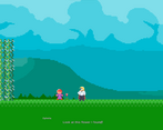
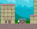
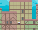
Some really nice elements here. It's clear that you've given some thought to the story. Also, I like the backgrounds, especially the lovely colors.
The main character is well-designed, but the walk animation isn't right. Because the player spends so much time looking at this sprite, this is more important than it sounds.
Note that when using pixel art, you probably want to use a pixelated font. (You can find many on Dafont.) Otherwise, there is an odd contrast between the font and the graphics.
Lastly, I didn't get any sound playing. Even if you don't have too much time to spend on sound design, a little goes a long way toward increasing immersion.
Thanks for playing and the feedback!
Err, so the game just restarted after I talked to the wizard guy. Not sure if that was supposed to happen, but I'm gonna end it there, which is a shame, because this had basically no metroidvania elements. Maybe it was more like a demo for something to come, but this by itself wasn't too convincing imo
Hey, thanks for having a look at the game! The game ends at the Witch just due to time constraints. One element I was employing of the metroidvania genre was returning to an area with an upgrade that allows you to advance. This happens once Surtr gives the player the fire ring which allows you to progress past the thorns.
I guess that counts, but in all instances of gameplay, you were forced to go into one direction only. Although I shouldn't keep hitting on this, it's clearly unfinished, hope you can make something great from this