Play game
Dudubot's itch.io pageResults
| Criteria | Rank | Score* | Raw Score |
| Overall | #2 | 3.389 | 3.389 |
| Music | #2 | 3.750 | 3.750 |
| Sound effects | #2 | 3.500 | 3.500 |
| Fun | #2 | 3.250 | 3.250 |
| Releavance to the metroidvania genre | #2 | 4.250 | 4.250 |
| Animations | #2 | 3.750 | 3.750 |
| User interface | #2 | 3.500 | 3.500 |
| Controls | #2 | 3.000 | 3.000 |
| Graphics | #3 | 3.250 | 3.250 |
| Story | #3 | 2.250 | 2.250 |
Ranked from 4 ratings. Score is adjusted from raw score by the median number of ratings per game in the jam.
Team/Developer
Wigner Matos Costa - Programmer
Leave a comment
Log in with itch.io to leave a comment.



Comments
I played it for a while, but I didn't reach the end because I am bad at navigation. There is a lot of stuff in there, and I really had a fun time while playing, even if the sometimes tight jumps and instant death gave me Flash game vibes.
I'm not the first one to say it, but the big crate textbox is annoying. You should add coyote time to the jump too, because I had many death related to slipping off platforms (especially in the spike pits requiring the dash, and also the red platforms). I don't know if it's normal, but I gave up at the big crate just after the first falling platform because I pushed it against a wall and can't get to the ledge on the right if that's what I'm supposed to do.
I found a cool thing about slopes, if you dash on them you get a very cool high jump and I loved it. I also liked the section with the red platforms, woke up my nightmares about Heatman's stage I thought I got over a long time ago :P
The sections with moving platforms are a bit scary, because they are so far apart, but in the end I didn't have much trouble with them. One thing you could do also is make the dash a bit longer, and widen the first spike pit to make it obvious it's not just the player messing up their timing on the double jump.
You did all that yourself ? That's impressive, it's was definitely a lot of fun despite how unpolished it is. I wish you good luck if you plan to make an update, this game could get a lot of love if you do.
A polished and challenging platformer with good use of metroidvania elements. The music was also very fitting.
Here's some things I picked up on when playing:
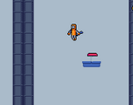
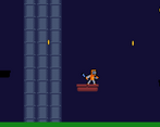
There are quite a few leaps of faith in the platforming sections, most notably in the part with many moving platforms. Even though you did a good job of using coins to guide the player, I often died to the spikes as I couldn't see the platform below.
Some assets (most notably the coins) are scaled differently to the others and they have a different pixel size. Most of your assets look consistent though.
When I touched the box one too many times, the "It's too heavy" dialogue didn't fade back out again and I was stuck with it on screen. Perhaps if I waited long enough it would eventually fade out, but there is no need to see the dialogue once you are away from the box, so you could fade it out then.
The dash could do with some more visual effects. It was functional, but seeing the player jump suddenly across the screen didn't match the polish shown in other parts of the game.
Good luck if you continue to work on this game!
That was nice. Here's my feedback!
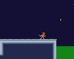
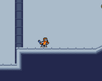
I liked the art. The animations were nice too. I wondered if the player could attack or not since he has what I guess is a wrench in their hand.
The upgrades were standard, but the level design made them stand out. There was a couple of tight jumps that made you glad you had them.
Here's some things that could be improved:
There's a lot of space between the moving platforms, you can't always see where each one is going, which makes you need to test it out by yourself, which leads to unfortunate deaths.
I don't know if it's an input thing or not, but text boxes, such as the "It's too heavy..." stays there for way too long. I have the time to read the text at least 10 times before it disappear. Although like I said, I don't know if I was supposed to press anything for it to go away.
I noticed on your page you were wondering if controller input worked: it does! I played with my controller. Only thing I noticed about it is the level on the top right of the map if I remember correctly. I couldn't pull it, either by pressing any buttons on my controller neither by pressing the X key on my keyboard.
Overall, it was very enjoyable. A nice mix of platformer and metroidvania.
You probably still do changes, but here's my feedback. I didn't finish it, sorry:
- one sudden enemy with a different AI is a bit breaking expectations of a player. If You want one to behave differently, make it with another color.
- the world is very big, and checkpoints are a bit rare. It would be fun to have something do do in it while You figure out where to go. For example, a power up which lets You spend coins for temporary speedup would be awesome. You probably may want to do something with it, but I can only judge what I see.
- Why all of a sudden a text box "its too heavy"? I think the big box is memorable enough, You don't have to stop the game there.
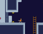
- Ladder has few bugs, for example jumping from it is cancelled by climbing.
- Leap of faith above spikes is something that is rarely liked by players:/
Overall, a bit WIP, but looks very nice, the animations looks cool, and the fact that each biome has different music is very nice. Keep it up!
Thank you very much for the feedback! Sorry for the problems during your gameplay :/. I really have to fix a lot of things in it, it’s still a very bad game and have a lot of design problems that needs improvement.
Regarding the box, you get an upgrade in another area that allows you to drag it. So, the text saying "It's so heavy", but from what I saw it was not clear to the players. Sorry about that too, I hope you can have a little fun and sorry for my bad english too.