Play game
MicroJam 14: Golden Goose Chase's itch.io pageResults
| Criteria | Rank | Score* | Raw Score |
| Use of theme | #31 | 2.111 | 3.500 |
| Presentation | #34 | 1.960 | 3.250 |
| Enjoyment | #36 | 1.508 | 2.500 |
| Controls | #38 | 1.357 | 2.250 |
| Concept | #38 | 1.658 | 2.750 |
| Use of prerequisite | #38 | 1.658 | 2.750 |
| Overall | #38 | 1.709 | 2.833 |
Ranked from 4 ratings. Score is adjusted from raw score by the median number of ratings per game in the jam.
Leave a comment
Log in with itch.io to leave a comment.


Comments
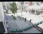
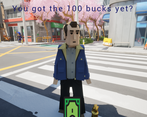
The game is fun and I liked the different options available. My main issue with it is that its hard to know what is interactable. After running around a lot I had a pack of gum that I didn't know where to use and there was a guy who lost their card that I had no idea where to look. Maybe if interactable had a highlight it would be easier to see. Anyway cool game nonetheless.
Thanks for the feedback! The gum part might be a bit too tricky. As a hint, it could be considered a type of food.
It’s a pity that the game can’t be played in the browser, I can’t play because I don’t have a PC
Tell me about it! I'd love to do browser support since I know that makes it much easier for people to play the game, but that's the price I pay for Unreal Engine development. I've heard that there's a team working on a WebGL packaging process of UE5, which would be great to have.
I don't quite understand how to play yet, but it's interesting, and the graphics are beautiful, just as expected from Unreal Engine.
Thank you for the reply! What did you find confusing about it? Did you read the controls on the page? I'd like to know so I can fix any confusion before others try to play. Thanks!
I mean I don't know how to make $100. I'm just confused on my own. ^^" It's not your fault. Your game is a lot of fun, and the concept is interesting. However, if I were to suggest an improvement, I think some camera angles, especially those that make navigation confusing, could be adjusted. If it were a more typical top-down view, I think it would be more user-friendly and the game would still be interesting.
Gotcha, I was afraid the controls weren't clear. You make a good point about the camera angles. I knew they were a weak spot but didn't have a ton of time to make them cleaner (or implement the mini-map I wanted). Thanks for the feedback!