Play game
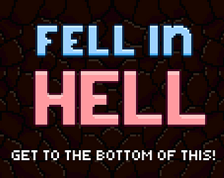
Fell In Hell's itch.io pageResults
| Criteria | Rank | Score* | Raw Score |
| Concept | #28 | 3.074 | 3.286 |
| Presentation | #30 | 2.940 | 3.143 |
| Enjoyment | #34 | 2.539 | 2.714 |
| Overall | #41 | 2.639 | 2.821 |
| Use of the Limitation | #47 | 2.004 | 2.143 |
Ranked from 7 ratings. Score is adjusted from raw score by the median number of ratings per game in the jam.
Team members
Te_Do (programming), Bo_Ru ("art", sfx)
Software used
Unity
Use of the limitation
"If you have no enemies you can't hurt them" - Sun Tzu, the Art of Gamedev (also hell themed)
Cookies eaten
Te_Do ate one. Bo_Ru had zero :( . No time for eating in a game jam.
Leave a comment
Log in with itch.io to leave a comment.


Comments
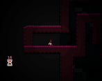
I enjoyed this. The controls are weird, I like the stilted run and the wall jumping, it feels like you lose momentum when jumping onto walls. Maybe let the character slide up the wall when jumping but stick when falling.
I can see myself buying this if there was more content, maybe reskinned as a flea simulator. Main character feels more like a bouncy little bug.
The bug idea seems fun, maybe in the future. Thanks a lot for playing the game!
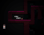
Cute art, not great mechanics, 7/10, amazing animations (especially the ending one, that was a treat!)
honestly the character sticks to the wall too much, even when I'm not tying too, I feel like you should have to hold the left key to stick to the left wall, for example, but here it just always sticks you even if you don't hold a direction.
The movement speed was a bit much and it didn't fit with the jump so the trajectory was too horizontal.
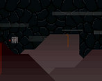
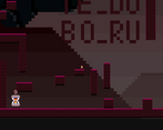
the map was good but you could skip some parts by just walking on the floor then climbing up at the end, and I did see some text mid way but there wasn't enough light or space to read it all (fell down from a higher place it said the developers names, nice touch).
some of the platform tiles need endings, its hard to explain with just text, but like the part where it changes color at the ends of a tile.
and I would definitely recommend publishing a webgl version, a lot of people would click on your page only to realize it's a download, then immediately click out.
Some music would've been a lot better, than nothing, and the rock noises at the title screen were unpleasant :(
tldr: good art, but the mechanics needs some work.
Thanks for the feedback! I completely agree with your points!