Play game
Pixelmania's itch.io pageResults
| Criteria | Rank | Score* | Raw Score |
| Use of the Limitation | #9 | 3.667 | 3.667 |
| Concept | #14 | 3.333 | 3.333 |
| Presentation | #18 | 3.000 | 3.000 |
| Overall | #24 | 2.979 | 2.979 |
| Enjoyment | #39 | 1.917 | 1.917 |
Ranked from 12 ratings. Score is adjusted from raw score by the median number of ratings per game in the jam.
Team members
KNO
Software used
Godot, Krita
Use of the limitation
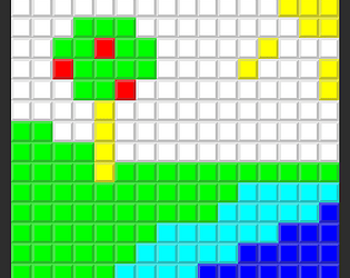
You must match a 16x16 grid of pixels that cycle through colors.
Cookies eaten
0
Leave a comment
Log in with itch.io to leave a comment.


Comments
The idea is unique, and fits the cycle theme however I think that the gameplay itself is a bit off. I agree that I'm bad at this game - true but there is little that I can do to interact with it. Even If i'd be better I'd be spending most of the time looking at flashing colors waiting for right color to pop up.
Some feedback below, feel free to skip:
I figured the game was supposed to be simple and not very complicated in design, but I think some more though should be put into gameplay and it's fun.
Also QoL change would be putting grid on the right side because even simple shapes are difficult to land because you don't know exactly on what square are you clicking.
Maybe a way to stop the colors for a little bit so you can actually click more than one/two squares, that would bering some player interaction and a fun way to test their reflexes
All in all the idea itself, is well executed, nice entry!
Fun idea, but I think it's too difficult
Very nice concept and a proper execution.
Quite nice difficulty changes, but I'd add a feature that would change which colors are changing based on which colors are actually used in the picture.
If you'd have only 2 colors (right side) on Easy. Player could make the speed faster -> end the game faster.
Really nice concept and matching theme 10/10
it is impossibly difficult or i didnt understand something, i did the first image in about 5 minutes of hard work, great idea but its impossibly difficult
The concept and presentation are mid. You should add some sound and music to make its more fun to play. And the game is so hard(to me), which make the game less fun. Keep improving, Good job.
i can’t actually play it for longer than about 20 seconds before the tab crashes, but the game looks like it has a neat concept!
Good idea