Play game
Express's itch.io pageResults
| Criteria | Rank | Score* | Raw Score |
| Innovation | #6 | 3.583 | 3.583 |
| Polish | #10 | 3.417 | 3.417 |
| Fun | #11 | 3.250 | 3.250 |
| Design | #13 | 3.250 | 3.250 |
| Overall | #13 | 3.490 | 3.490 |
| Theme | #15 | 3.583 | 3.583 |
| Minimalist | #15 | 4.083 | 4.083 |
| Audio | #17 | 3.000 | 3.000 |
| Adherence to Restrictions | #19 | 3.750 | 3.750 |
Ranked from 12 ratings. Score is adjusted from raw score by the median number of ratings per game in the jam.
Did you make the game solo or with a team?
Team
With a team? So, what was/were your role(s) and every person on the team role(s)?
amamakeart did most of the art and I did everything else.
Did you make the audio for this game during the game jam period?
Made all the audio during the game jam
Did you make the art for this game during the game jam period?
Made all the art during the game jam
Leave a comment
Log in with itch.io to leave a comment.


Comments
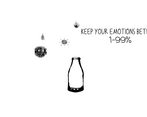
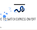
First off: the art design it absolutely wonderful! Definitely one of my (two) favourites this jam. I also like the idea of “bottling up your feelings” and its quite literal interpretation. This also fits quite nice with the expression mechanic. (I’d almost expect the blue bullets to be tear-shaped.)
As already mentioned by others, the actual implementation of the feelings/colour is somewhat clunky:
These points make the colour/feeling mechanic in its current form hard to notice. I think this is somewhat sad, as it seems to be a fine idea that fits together nicely with the art style.
Thank you for your feedback! I'm glad you liked the art and the mechanic of the game. Definitely needs some better polishing and more playtesting and adjusting. I'll probably update the game in the near future, so I'll be applying your advice then.
Not sure why this doesn't have more ratings - it was quite well done!
I really enjoyed the art style and the cheeky "only three colors on-screen at once" use of the restriction. It wasn't super clear what the different emotions did in terms of impact, which I feel was a bit of a missed opportunity if there was supposed to be a difference there (it seemed like there was, based on your description?). The SFX were a bit "blinky" I guess I'd call them - sort of noisy in an arcade-y kind of way, but that stuff is hard to balance, so I get it.
I must say that the dash was a weird inclusion to me. Like, I get it - you want to give the player the option to move more quickly, especially in a world of avoiding many projectiles and traversing a space that's larger than a single camera's view surface. However, when adding something, consider why; if the player has no reason not to press dash, then don't make it a button to press at all and simply make their movement speed higher (here, they don't have a reason not to dash, as the enemies only have collision-boxes, not damaging flags, as far as I've seen).
Still, the polish here is really nice, and it complimented your emotions mechanic well (could have been even better in terms of mechanical clarity, but you brought something unique already, so..).
Thank you for the detailed feedback! There are differences in using different emotions regarding bullet speed and rate in the game, but I do agree that it could have been made clearer and more unique from each other. Now that I look back on it, I can see how the sfx can be noisy at times, and there are definitely ways I can easily improve them. I added the dash mechanic for the heck of it and the fact that I see it used a lot in 2d shooter games I've played, so I understand that it could appear unnecessary to other players. Maybe I'll go experiment with its features just to make it more useful or something. I will take everything you put here into consideration and hopefully make the game even more polished and unique. Thank you so much for playing!
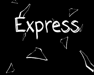
Very cool art, looks like handrawned giving it a Unique Style. Controls and mechanics were simple and understandable. I really like small details like the "Emotions" moving inside the bottle, and also cool game cover. I wish there would be multiple smaller levels before the boss battle, that would help the player to focus on moving forward rather than wandering around in a larger area.
Pretty cool, keep going! Thanks
Thank you for the feedback and support! I agree with you on adding more levels. I hope you had fun.
Really nice idea for a game! Good flow to the game, but I wish there were more levels and mechanics. Nevertheless, I had fun playing the game!
Thank you for the feedback! Glad you enjoyed it. I do have some ideas that I wish I could've added, but I'm still very grateful I had finished it.