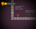
Play game
The Lamp of I's itch.io pageResults
| Criteria | Rank | Score* | Raw Score |
| Creative use of art assets | #275 | 3.130 | 3.500 |
| Overall | #450 | 2.609 | 2.917 |
| Engagement | #503 | 2.460 | 2.750 |
| Overall polish | #519 | 2.236 | 2.500 |
Ranked from 8 ratings. Score is adjusted from raw score by the median number of ratings per game in the jam.
Leave a comment
Log in with itch.io to leave a comment.


Comments
I like the idea and the sound effects were great. The animations for the enemies dying were good but I felt there could have been more polish for when the player dies, rather than just a quick cut to the menu screen. The tutorial was helpful too!
Creative use of assets for sure, I also like the idea of keeping on the light even tho it thematically doesn't make much sense. I was kind of confused cuz there seemed to be no exit to the first level. Did I miss something or does the game just end there?
I had actually started a little late on the game, and have been busy so I could only make that much : )
Unexpected us of assets :)) Interesting idea! It seems that jumping over the enemies is a little difficult and not as rewarding as I'd like it to be. Anyway good job :)
I like the idea of the game, and also the fact that the tutorial could be played separately, an awesome feature for hurried testers! Furthermore, your game (out of the 12 I've already played), is the first one to have audio :D. The game was pretty hard though, and pinpointing the bones was a hell of a struggle, you should increase their hitboxes! It seems to me too, that your viewport is going out of scale in the web version. Here is what I recommend:
In the project settings:
-go to window
-set the stretch mode to 2d
-set the aspect to "keep"
this way the window will fill the screen and keep its aspect ratio around your viewport!
Overall, I gave this 3 star engagement (for its difficulty), but 4 star polish, an awesome effort!