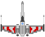
Play game
Destruction!'s itch.io pageResults
| Criteria | Rank | Score* | Raw Score |
| Audio | #42 | 2.818 | 2.818 |
| Movie Interpretation | #80 | 2.955 | 2.955 |
| Visuals | #91 | 2.273 | 2.273 |
| Fun | #96 | 1.909 | 1.909 |
| Overall | #97 | 2.136 | 2.136 |
| Gameplay Innovation | #100 | 1.682 | 1.682 |
Ranked from 22 ratings. Score is adjusted from raw score by the median number of ratings per game in the jam.
IMDb link
https://www.youtube.com/watch?v=2WBG2rJZGW8
Movie scene description (plus video link if possible!)
The battle right before the trench run where almost everyone dies.
Does your game or video link contain movie spoilers?
Yes (minor spoilers)
Please list any pre-made art/music/other assets that you used.
-charcter.gif (Google Images)
-deathstar.jpg (Google Images)
-By-The-Coder (1).png (The_Coder)
-Underclocked.mp3 (Eric Skiff)
How many members in your team?
1
Leave a comment
Log in with itch.io to leave a comment.


Comments
Neat shooter. I included it in my Movie Game Jam compilation video series, if you’d like to check it out! :)
Thanks!
Kinda struggled with this one - took a while to find the controls.
Then it seemed to me the whole game was off-centre? Perhaps I missed something.
The music was awesome tho! :D
Thank you but the music is not mine it is Eric Skiff's I suggest you check him out!
I think spawing in the middle would be more fair since tie fighters can fly up behind you. I raelly like your artwork and sound. Also the controls would help when playing for the first time.
Thank you but the music is not mine it is Eric Skiff's I suggest you check him out! The art work was just me modifying some images from google but thank you. The reason you died was because he shot you with a laser. The tie-fighter starts in front of you first so you can shoot him but then starts behind you so there is a bit of a challenge.
Have to agree that grey-on-grey was hard to figure out. Also the hit-boxes seemed a little off or too large. I wouldn't have chosen to do this scene top-down because the tunnel flight is so iconic, it loses some impact without the perspective. Thought it was a good effort overall.
Thanks for the constructive criticism!
I had a lot of trouble seeing the green and red energy blasts. Having some sound effects play when they are fired could help make it more obvious to the player.
Yeah I will do that in the future!
I would agree with the previous comment on it being a little hard to see the sprites against the background. Music is fantastic even if it doesn't quite feel very Star Wars. It might also benefit from sections you could clear that get progressively harder to add some extra challenge as you get further into the game (e.g. more enemies, faster enemies etc). Good job though :D
Thanks!
It was a little hard to see the sprites on top of that background and it looks like the score doesn't reset after each run (though maybe that's a feature so every run is a high score run!).
Definitely gets the point across of racing to destroy the death star. Nice job!
Thanks! And yeah I forgot to restart the score whoops!
It reminded me Star Force for NES.
Cool