Play Musical Weapons
Musical Weapons's itch.io pageResults
| Criteria | Rank | Score* | Raw Score |
| Fun | #45 | 2.588 | 2.588 |
| Music | #63 | 2.412 | 2.412 |
| Overall | #73 | 2.176 | 2.176 |
| Visuals | #78 | 1.941 | 1.941 |
| Innovation | #96 | 1.471 | 1.471 |
Ranked from 17 ratings. Score is adjusted from raw score by the median number of ratings per game in the jam.
Please list any pre-made art/music/other assets you used.
Backgrounds.
How many members in your team?
Team of 3
List your team's social media / website links!
arcus.itch.io
daniel-michaeloudis.itch.io/
Leave a comment
Log in with itch.io to leave a comment.



Comments
Interesting idea! I included it in my compilation video series of the Ludum dare 42 compilation video series, if you’d like to take a look :)
This gam was not for Ludum Dare 42...
This was: https://arcus.itch.io/groundfall
That was quite a bit of content for such a short jam. Good job! It needs a little polishing, but it's a solid start so far.
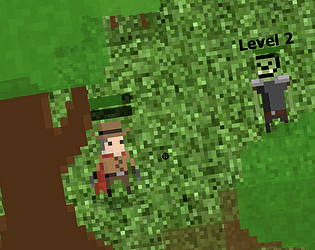
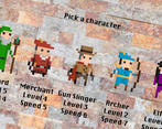
Nice, the main game idea is actually pretty solid, the music works pretty well, and the pixel art for the characters is nice. I'd suggest making all the art assets at the same pixel art resolution, as it's pretty jarring seeing different ones next to each other. There's not a lot of "music" in the gameplay though - just making the bullets look like music notes and calling it "Musical Weapons" seems a little tenuous. :)
But my main problem with it is just how easy it plays. It could be a fun little Gauntlet-alike if it was a lot harder, but it's too easy to just plod through the levels and feel in no real danger from the enemies.
Hey! I just wanted to let you know that a video of one of my playthrough/reviews is up and you're a part of it!
Take a look here:
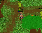
Yeah, this was alright. The last boss (that I got to) was completely invisible and impossible to hit... Bit of a bummer there... The game wasn't too driving and I did get bored after a bit. make the levels more challenging or make them shorter with more minibosses/interesting things. There were quite a few little things like, accidentally buying items in the shop while the screen didn't appear to be active, moving while the next level shop buttons appeared around you, enemies behind objects completely unable to see them, etc. that could be polished up and made better!
Overall though, pretty great work!
The game was quite fun !
The thing is that it was way too easy after few level and it was at this moment i stop playing it.
The background don't really fit with the pixel art art direction.
But the music was pretty cool !
Some suggestions:
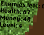
A classic idea done well. Not sure what the second bar on the character is for (some sort of stat level up?), but I love that as you upgrade the weapon you get different sounds. Made it into the spider levels. I might suggest dropping the volume down on the squeak sound, just because it's a little sharp as is. Also it seemed a little strange the coined dropped pretty far away from each spider. But those are nitpicks. Overall, a good job.
Quite fun for a simple concept; love the pixel graphics but the pre-made textures backgrounds don't really fit it.
Easy to play, jump straight in and you're away!
More oomph needed to mark events in the game - hitting, being hit, levelling up - these events should have a bigger audio/visual impact.
I liked the music, it fitted well in the background and added feeling to the experience.
Didn't see any innovations in game mechanics, but this game is actually fun for me. Some immediate improvements could be slowing down the bullets, and also introduce more patterns for different types of enemies.
There is some work, but this is too easy, not beautiful and quite boring.
That's a cool concept and I like how after each upgrade the weapon looks and sounds different!