Play game
Shinoban's itch.io pageResults
| Criteria | Rank | Score* | Raw Score |
| Enjoyment | #8 | 3.692 | 3.692 |
| Overall | #20 | 3.596 | 3.596 |
| Design | #28 | 3.462 | 3.462 |
| Adherence to Restrictions | #33 | 4.231 | 4.231 |
| Use of Theme | #40 | 3.000 | 3.000 |
Ranked from 13 ratings. Score is adjusted from raw score by the median number of ratings per game in the jam.
Leave a comment
Log in with itch.io to leave a comment.


Comments
The puzzles felt great and I actually had to reset atleast 5 times on the last one, so thanks for the R button magic
The tower part kind of felt random and out of nowhere, I was a bit confused as to its connection to the game, but the sokoban puzzles were really really good, congrats.
I really enjoyed your puzzles, I just felt like the tower part had an unbalanced difficulty curve, as in, it got hard way too fast. I also felt like that tower part was only there because of the jam's theme, so it didn't really feel like it was connected with the main part of your game. Either way, the puzzles were awesome, really liked it! Good job c:
I felt some disconnection between two diffrent parts of the game( i understand thats its because of the theme :) ). Sokoban was really well executed thou :)
Hi, thank you for playing my game!
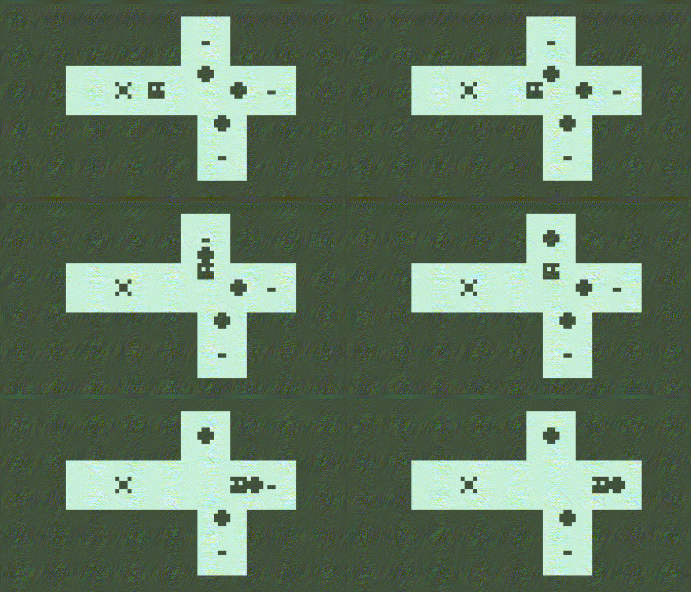
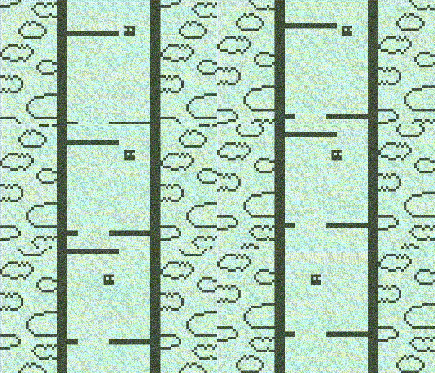
I didn't make the sound for this game so I honestly can't tell whether it fits the restrictions or not , but for the "graphic" part I can assure you it does. The resolution of the window is more than 84x48, but the actual pixels that the player can see are 84x48 (you can easily check that in the puzzle part). About the free fall part, the obstacles and the background are moved (simultaneosly) one pixel per time (please note that I move their position and I don't use functions like Transform.Translate() etc. ). You can clearly see that when the level starts but after you pass through some obstacle you can't see it anymore: the objects are still moved one pixel per time, but the time between each movement is shortened so it's impossible to notice it. That fits the restrictions though, because there are no limitations on the frames per second!
So, if I missed something, please let me know, thank you.
Dammn this was pretty fun! Loved the puzzles! DENOUTTADEN
The tower sections are fun and the puzzles are great, but I do feel there's a sudden difficulty spike after the first two challenges the game throws at you. Still, nice game!
Thank you for playing my game!
I agree, the second level should be a little more difficult and suggest to the player some "tricks" that are useful to solve the next levels. Creating two types of gameplay in one game took me so much time, I should have focused a bit more on the level design. Thank you for your feedback!
i thought this was a really fun game and the second phase is really nice, it gives a sense of "newness" which makes it to where i dont get bored of it. overall, amazing game!
Thank you for playing my game!
That's why I added a second part to the levels. I wanted to give the player a sort of "break" between the puzzles, because in my experience puzzle games become boring after a while :)
I'll give 5 stars on Adherence to Restrictions... But that logo in the beginning is definitely higher resolution than 84x48. :P
Okay, so serious talk. I don't really understand the why the second phase of each level exists. It doesn't pack a challenge and is just so different from the main gameplay... So the main gameplay. Well, the levels design isn't bad, but I really miss that "Undo the last move" option. It is so frustrating when you have to restart a level just because you push a box to the wrong location accidentally. Especially on a longer one. You should use this rule when you are designing the levels: "If you know the solution to a puzzle, it shouldn't be hard to do it."
Overall, I like what you've made, the game was fun. And funny enough, the main reason I check this game out was the title「死の番」. (Which, if I understand it well, means "Death's turn") :D
hey, thank you for playing my game!
I added the second phase because I thought that the first phase alone wasn't enough to fit the theme. I missed too the "Undo" button, but creating two games in one took me so much time that in the end I didn't have the time to add it. In the future games I'll probably focus on one type of gameplay, this was an experiment :)
Oh, thank you for your tip, this is actually my first puzzle game! And about the title, I don't know, my friend (FUSED) made the logo and I don't remember its meaning...
IMPORTANT! If you don't understand how the game works, please go on the game's page, there's a brief tutorial. I'm sorry but I didn't have time to add a tutorial in the game