Play game
T9's itch.io pageResults
| Criteria | Rank | Score* | Raw Score |
| Use of Theme | #40 | 3.000 | 3.000 |
| Adherence to Restrictions | #56 | 3.950 | 3.950 |
| Overall | #56 | 3.087 | 3.087 |
| Design | #59 | 3.050 | 3.050 |
| Enjoyment | #78 | 2.350 | 2.350 |
Ranked from 20 ratings. Score is adjusted from raw score by the median number of ratings per game in the jam.
Leave a comment
Log in with itch.io to leave a comment.



Comments
Managed to find all keys, was expecting a bit more for the ending, but overall had fun searching in this big map (even though going back and forth between the dark and light worlds started to get a little bit long)
So, I found all keys and was able to find the error. Is this the end? Or did I miss something?
Sadly thats the end. I didn’t have time to implement the “true ending” i had hoped for. Sorry
At first I struggled to find the first key until I saw in your comments it was near the start. I see I'm not the only one that happened that, I think it is because the screen borders up and down the screen look more like a wall than a border and it gets confusing.
After I found that key I was able to die and appear in the dark world, that was a nice surprise. It is a clever usage of palette and a good use of the theme.
However I wasn't able to find more keys, the map is too large and I get disoriented right away but I would like to play more if it were easier to find the items.
Yeah, i was very conflicted about adding the border in... it was the only way i could have a perfect number of tiles on screen at 7x7 per tile. Some more npcs or clues for keyfinding probably would have been great.
Great design and transitions in each field. Could use a map so it players won't get lost easily. You could work with this but it needs a little bit more mechanics.
Thank you! I wanted to implement a map, but ran out of time. Maybe in a dx version?
Really liked the art in this one
Thanks! Im pretty happy with how it turned out. I could definitely improve by adding more variation in future though...
One of my favorites so far! I really liked the gimmick and the rotating text thingy. What I would recommend:
Thank you! I’ll definitely try and add these if i ever make a dx version!
I wandered around a lot and found key 1! The map is very large and spread out which sometimes makes exploration feel like a chore instead of a reward for unlocking an area. I did have fun though! Great job!
Thank you! I’ll keep that in mind for the next game im making
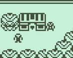
Nice zelda-esque graphics. But I wasn't able to find any keys...
I walked around in circles until I finally had to give up. It looks like you had some dungeons and stuff, but unfortunately I couldn't find them :(
oh, it didnt have anything major, but if you want to try again key 1 is just right 1 screen then up 1 screen from the start area, in a chest
I spent a solid 10 minutes wandering around pressing e on everything before I finally had to give up. I never saw anything that resembled a key, and the only interactions seemed to be the dialogue with other characters. I'm pretty sure there's more to this game, but I wasn't picking up anything the game wanted from me. Unfortunately, I didn't get to see whatever else you had in store.
Selecting a font was a nice touch, and the logo is really nice looking. I also liked that you could slip under the covers in the beds. The movements were all really fast, so I couldn't tell if there was any sub-pixel movement or not. If there wasn't, you did a great job at making the camera pans and player movement look smooth. Maybe too good, since it almost looks like you bent the rules to achieve it.
First key is left 1 screen right one screen from start. Your right! I had Zero subpixel movements!
Graphics look great and read well. Allowing the user to select a font is a nice touch. The map is disappointingly empty for its size, though, which makes exploration less fun than it should be.
yeah, i had WAY more ideas, but ran out of time...
An interesting game
thank you! I really liked your game by the way!