Play game
KNIGHTS OF THE BREAK TIME's itch.io pageResults
| Criteria | Rank | Score* | Raw Score |
| Does this beat boredom? | #21 | 3.750 | 3.750 |
| Was this legitimately developed during this Jam period? | #26 | 4.750 | 4.750 |
| Overall | #47 | 3.750 | 3.750 |
| Does it implement the theme well? | #76 | 2.750 | 2.750 |
Ranked from 8 ratings. Score is adjusted from raw score by the median number of ratings per game in the jam.
Leave a comment
Log in with itch.io to leave a comment.


Comments
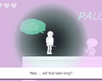
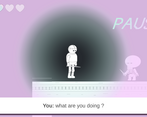
Knight: Pause, please!
You: Don't tell me what to do!
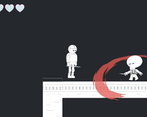
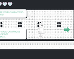
This is great, I like the art. You know what? Looking at the art style I think you might try to change everything to look as it was drawn on paper, that's the feel I kinda got from the first impression. Yes, there were some inaccuracies, not a big deal, though. The slash indicator image was missing sometimes (layer problems I guess).
This B&W art with some extra colors works well together. Music and sounds support atmosphere and innovative story line is cool. There was some inaccuracy in movement/colliders, but nothing big or too annoying. Very nice and entertaining game :)
Very nice game and good graphics
love the art, very aesthetic! Also this kills boredom really well. Solid submission
Hello everyone!
We managed to fix a few bugs after the submission end, so if you want the proper 'KNIGHTS OF THE BREAK TIME' experience, it's this way --> brule.co/lab/KOTBT
Thank you ;)
Really cool Game, I especially enjoyed the story you integrated into the game play, the pause really helped me focus again ;P.
The music is really nice as well and I love the Font you're using it looks astonishing. For the graphics they are simplistic but I really like them, the only problematic thing is that it's sometimes hard to distinguish between the background and the Player Character because everything is just white. I would make the character competently black or add something else so you can distinguish him better.
Besides that really cool Game and surprisingly good story much deeper than I expected at first :D
Thank you so much!
We'll ckeck S.O.F too!
Take it easy ;)
good, the gravics look a bit of but thats easily fixed
fixed!
thank you very much :)