Play asset pack
Steam Train's itch.io pageResults
| Criteria | Rank | Score* | Raw Score |
| Visual | #2 | 4.571 | 4.571 |
| Technical | #5 | 4.190 | 4.190 |
| Overall | #5 | 4.270 | 4.270 |
| Concept | #8 | 4.048 | 4.048 |
Ranked from 21 ratings. Score is adjusted from raw score by the median number of ratings per game in the jam.
Does your model adhere to the limitation?
No
Leave a comment
Log in with itch.io to leave a comment.



Comments
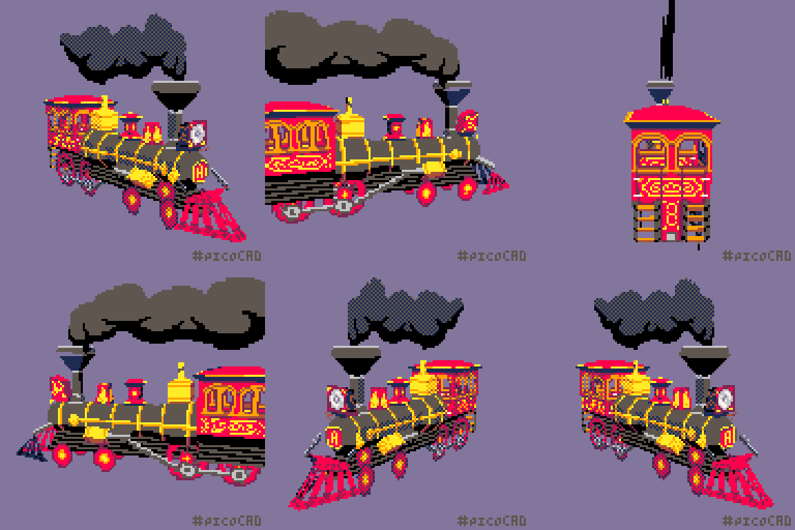
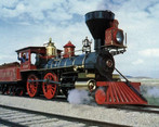
I both like this because old trains are neat, and also it reminds me of the paper trolleys I would get from The Old Spaghetti Factory when I was a kid. Your smoke is on point.
When I first got the theme I wanted to do a stage coach, but changed my mind. Glad someone captured that 19th century vibe. Wonderful work! Your smoke cloud is perfect!!!
Hey,
It seems your model doesn't really adhere to the limitations.
You might want to change the answer to no as to keep the Jam fair.
Changed it, will check it over when I get home. Sorry about that!
incredible details, has the feel of a delicate paper model
This is insane! This definitely has the most clear/easy to see design out of all the ones I've seen so far. Great job!
Really cool model with plenty of detail. The colors are just right!
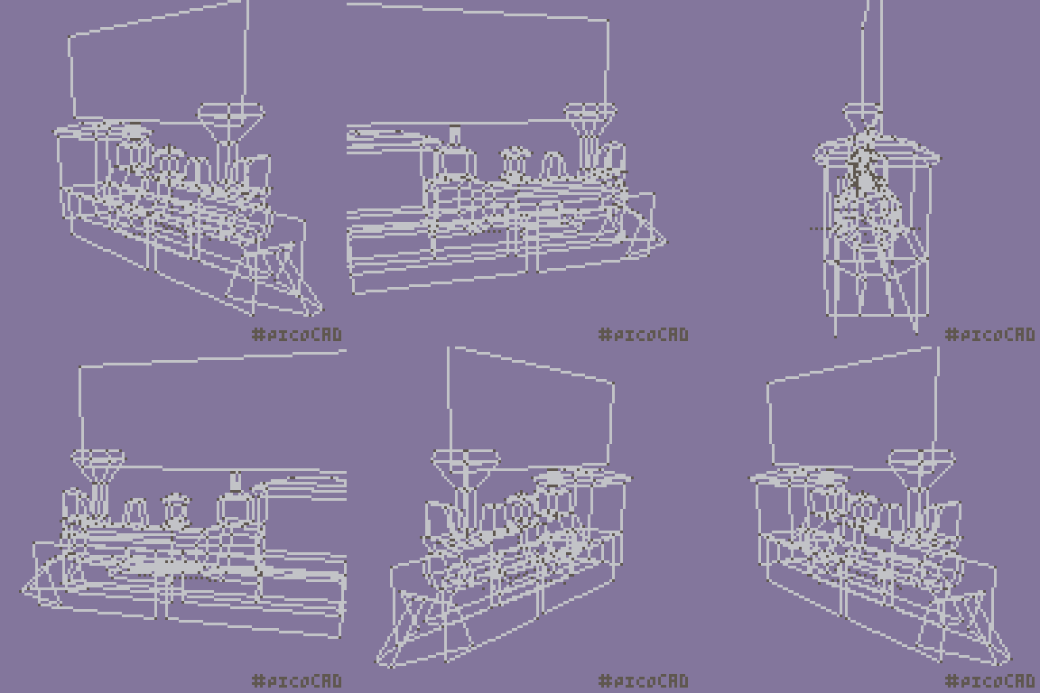
Quite a detailed model! I see some glitches, especially on the wheels... but I understand how difficult can it be to balance them... Congrats on your submission!
Lovely work all around! The smoke initially caught my eye but there's plenty of great detail throughout.
I do kinda wish there was less clipping/popping with the rotation since it distracts a little from the piece itself but I know that can take some fiddly tinkering to reduce and is often still somewhat unavoidable.
Thanks! I spent WAY too much time trying to fix that, and just had to give up haha
Yeahhh it's always gonna be tricky when stuff overlaps. Minimizing that (Ex. by cutting off the upper parts of the bigger wheels) might help? Also with the front wheels you might've been able to actually reduce some of it by disabling double-faced drawing so they didn't render on the opposite side.
But yeah the rendering quirks are def the most frustrating part of picoCAD. The model still works great despite them tho!
Good tips! It's really the thing I struggle with most. But accepting the limitations is part of the fun of it! So I tell myself haha
Beautifully done! 👌
So much detail! Great job