Play Hikikomori
Hikikomori's itch.io pageResults
| Criteria | Rank | Score* | Raw Score |
| Objet d'art | #7 | 4.412 | 4.412 |
| Stank | #10 | 4.118 | 4.118 |
| ??? | #15 | 3.882 | 3.882 |
| Theme Use | #17 | 3.706 | 3.706 |
| Overall | #19 | 3.647 | 3.647 |
| Stink | #20 | 3.529 | 3.529 |
Ranked from 17 ratings. Score is adjusted from raw score by the median number of ratings per game in the jam.
What modifiers did you use?
Fluxus, Butts, Blood Sacrifice
How would you consider this game to be Pompous Trash?
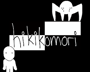
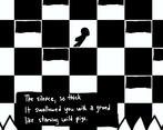
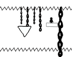
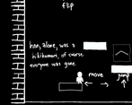
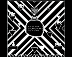
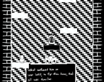
I went as arrogantly artistic as possible by using only two colors and all hand drawn graphics including text. It's trash because it's a platformer, the vanilla of game genres.
Did you accomplish your goal?
And how!
What was your goal for creating this game?
To use only two colors and make something that does not suck while telling a subtle, simple story.
Leave a comment
Log in with itch.io to leave a comment.


Comments
The controls were hard to navigate but the atmosphere for this was pretty nice. Liked the little narration and it reminded me of this game called Company of Myself that I played a long long time ago.
Yeah controls are on the overhaul list as of now. I will have to check tbat one out! Glad you enjoyed the story. Appreciate it.
In the realm of mechanics, a vestige of ambivalence exists, a vestigial evocation of an arbitrary disposition—an ostensible capriciousness permeating the equilibrium between controls and hitbox delineations. Further, the expansive scope of the game, while undeniably opulent, occasionally evokes sentiments of protracted sojourn. Yet, despite these trials, a triumphant crescendo emerged—an almost Dark Souls-esque crescendo of fulfillment, the zenith of satisfaction attained through an unswerving traversal of adversity's labyrinthine passages.
I wish itch.io had the ability to pin comments. This is gold!
Not the first to mention the physics. I am seriously considering an overhaul on them.
Controls were a bit much, but I got through it 👌
Aside from that, everything else is a good cohesive whole 👏
Although, it took me quite a while to figure out what to do on the level with the portals to the left and right of a bunch of platforms 😫
Oh wow! You made it to the portal maze!
Dr Tentacles will be posting the solution to that one on his socials soon.
I absolutely love the art and theme on this one, monochrome, creepy, trashy and hand-drawn, its all perfect. However, I am not a huge fan of the slidey and stiff controls.
yeah, not much time to give a proper jump arc but I am glad you enjoyed it! Thanks for the feedback! For what’s its worth, there are some puzzles which use that floaty-ness to their advantage.
Hand drawn art with line boil, max contrast palette... solid platformer and good idea however arrived; mad respekt for the hand-drawn animated particle effects with the falling leaves, great juice!
Yeah those leaves came out way better than they had any right to in a trash jam. Thanks for that! Glad you enjoyed it!
Pretty neat concept. Like the visual style. Got stuck once or twice too.
It felt a bit too easy to accidentally swap between white and black on some of those platforms and fall to my death, but overall very cool and the vibes are good
You approached the theme so earnestly! Great execution.
Thank you for that! I appreciate the feedback!