On Sale: GamesAssetsToolsTabletopComics
Indie game storeFree gamesFun gamesHorror games
Game developmentAssetsComics
SalesBundles
Jobs
TagsGame Engines
A jam submission

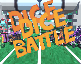
Dice BattleView game page

Submitted by Team Croissant, maxwellpark, Stefano di Pace, lil_noI (@____NoI____) — 4 hours, 54 minutes before the deadline
Add to collection

Play game

Dice Battle's itch.io page

Results

CriteriaRankScore*Raw Score
Audio#293.2003.200
Graphics#323.4003.400
Overall#443.0003.000
Fun#522.8002.800
Gameplay/Design#622.6002.600

Ranked from 5 ratings. Score is adjusted from raw score by the median number of ratings per game in the jam.

Leave a comment

Log in with itch.io to leave a comment.

Comments

Submitted(+3)

Love the visuals, character design, and sound design.  Very complete and playable.  Great work putting this together.  I also like the concept that a dice roll will determine whether your strategy needs to be defensive or offensive.

To me it feels like the design of this game is in a tricky place between action gameplay and turn-based strategy gameplay, which is a cool idea, but very tricky to execute because action games are usually super fast paced and TBS games are usually slow and thinky.   I'm sure it's possible to combine them, but it's just hard to do.  Currently the gameplay of this game feels pretty random, not the dice part but the combat part.  It feels like the enemy movement RNG is the thing that lets me succeed or fail, more than my strategy.   I think it's also a little too easy to get a draw currently, so I can just wait until I get a good roll, have a bunch of shots, and I can spray them around.   I'm sure good enemy UI is very hard to implement, but that's a big issue right now.  Also, I wish the barriers felt more impactful.   

I think shooting down 3 lanes is a good set up for some simple strategic puzzles, but I think this game needs some balancing and probably some more mechanics to really stand out. 

Still, it's clear a lot of work went into this and it's very impressive.  

Submitted(+3)

I really really like the character design. With a bit of UI design and more mechanics this could be a solid game!

Submitted(+3)

I got some strong Battle Network vibes. No idea who the characters are or how that impacts gameplay. My main thing is that the background felt far too noisy for what was going on. Everything seemed bright and “in my face” that I wasn’t sure where to focus? I know the action was going on in the field, but it felt like I couldn’t put my attention there. This was even more apparent in between rounds where I couldn’t even read the text depending on the background’s state. Perhaps just a background tint where the text is could help? Overall I think it was fairly fun, just hard to read.

Submitted(+3)

I think the presentation quite good, although it needs some work. like the tutorial says that you take shoots and then you have to reload, but it should be that you shoot and then reload. In the result screen, after every match, the white text can be hard to read because parts of the background are also white; text with outline helps.

I played the browser version, and it's  quite buggy, I would roll the die and get a number, and then get a completely different number of shots and shields. 

I quite like the music and the presentation, I think they can be amazing with some polish. I love the character select screen, it reminds me of Fatal Fury 3's character  select screen. The gameplay looks a bit like Megaman Battle Network. Idk if any of that is a coincidence or not, but I like it. 

Keep it up, I think the game has a lot of potencial. 

Developer(+1)

Thanks a lot for playing and giving feedback, all makes sense. Yes it is strongly inspired  by Megaman Battle Network, glad you noticed that :)

I'd like to improve the things you mentioned