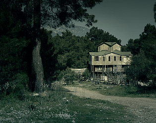
Play game
Beginning Hour: WIP Demo's itch.io pageResults
| Criteria | Rank | Score* | Raw Score |
| Most promising demo | #12 | 2.750 | 2.750 |
| Best descriptions | #16 | 3.000 | 3.000 |
| Personal favorite | #18 | 2.500 | 2.500 |
| Best emotional impact | #18 | 2.250 | 2.250 |
| Most fun to play | #22 | 2.500 | 2.500 |
| Best game mechanics | #25 | 2.000 | 2.000 |
| Best character(s) | #26 | 1.750 | 1.750 |
| Overall | #27 | 2.139 | 2.139 |
| Best use of multimedia | #30 | 1.250 | 1.250 |
| Best visual design | #31 | 1.250 | 1.250 |
Ranked from 4 ratings. Score is adjusted from raw score by the median number of ratings per game in the jam.
Content warnings
Strong language, descriptions of violence, and dead bodies of both animals and people
Game status
Work in progress demo
Leave a comment
Log in with itch.io to leave a comment.


Comments
Hey, just wanted to leave my 2 cents in. The atmosphere is interesting, but the design is a little frustrating. As ghostchibi has pointed out, there are too many links, most of them are simply examinations that require you to go back, and the navigation gets a little confusing.
My personal recommendation would be to separate "examine" links and "actions". Instead of having "examine" on the bottom of the page, the object to be examined can simply be a link itself in the text. Furthermore, you don't need to take the player to a new passage for every examination. You can have a section of the page dedicated for what the player is looking at, and it gets replaced with the description when you click on something. This would make the gameplay more convenient and transparent.
Of course it's just one possible way of doing things ^^
Hi Vincent, thanks for playing! Having some links that reveal more text within the same passage seems like a great idea for reducing the long lists of things to look at; I've seen that used effectively in a lot of the other entries so it would be good to try.
I can see the merit in reducing the number of separate passages, but I'll have to be careful since there is some secret stuff you can find if you fiddle with things in your inventory while you're looking at a certain object. This might be the source of your frustrations, so it's something I'll need to take a look at!
Thanks for your feedback!
Well written! I included it in my Spring Cleaning Twine Jam compilation video series, if you’d like to take a look. :)
I've been running in loops around the house, which I assume is inevitable since this is a demo and not because I'm missing something (or maybe I am? who knows). The sudden descriptions of footsteps and breathing in passages I've visited before did give me a bit of a jolt, but I'm admittedly a scaredy cat. Images or sound in the final product will help the atmosphere I think.
If you'd like some more in-depth critique:
Since it's RE-based I'm not surprised to see all of the viscera, blood, and unidentified grossness, but I think maybe there's too much? Some of the choices felt like they were there just to reinforce that the house looks and smells gross, but that's already very well described. Visuals that are seen no matter what work well, but translated directly into text that you need to click in order to see, it ends up creating a distraction.
Hi ghostchibi, thanks for taking a look at my game! I agree there is too much stuff to click on right now; I'm hoping when this is finished it will serve to give some red herrings to look at so you can't find the correct path by clicking blindly, but much more of the house will become functional as I add stuff.
There is a second "ending" to the game (it's not completely finished so it's a little abrupt). You need to use your knowledge from your first playthrough to find another path ;)
Thank you for your feedback! I'll look into trimming some of the (gratuitously icky) fat so players aren't walking round in circles so much :)