Play game
Loop's itch.io pageResults
| Criteria | Rank | Score* | Raw Score |
| Gameplay | #8 | 2.739 | 3.000 |
| Overall | #9 | 2.799 | 3.067 |
| Theme | #9 | 2.860 | 3.133 |
| Visual | #9 | 2.982 | 3.267 |
| Audio | #13 | 2.373 | 2.600 |
Ranked from 15 ratings. Score is adjusted from raw score by the median number of ratings per game in the jam.
Leave a comment
Log in with itch.io to leave a comment.


Comments
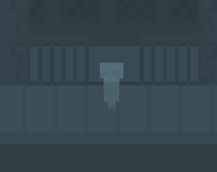
Really cool idea and the ending; asking you what have you done. The monotonous art style added to the mood of the game. Could have used a soft background music.
I'm just curious what the second ending was...
Just one word...
Epic!
Thanks
This game did give me goosebumps at the end, it was a different experience.
Thanks for your comment and there was actually one more ending.
Really? Then I'll play it again to see what that ending is about
Have fun
This game almost made me, for lack of better words, crap my pants. The art style and music made the gameplay more haunting and when the words popped up "What do you think you have done?" I knew I was in for a wild ride. This simplistic and yet introspective game really hits in a lot of weird places and gives you more questions without having any base to find the answers to them. A problem I had was the blending of colors for the UI, I'm a tad colorblind and this made it very hard to determine time and score. Other than that, this was a pretty great game! Nice job!
Thanks for your comments. Art style itself is using a color palette which colors close to each other. Do you think the same for the sprites?
My ideology(which is really just my personal perference), is that the colors for the UI specifically should have a contrasting colors for the sake of clarity. That being said, I think the color palette for the rest of the game is actually very nice. I just would've preferred if the timer/score was black or white.
Thanks for your feedback and telling me what you don't like in the game. Making the numbers few tones brighter also could work.
I really enjoyed the style of the game, however, I had an issue where the UI would blend into the game and I couldn't read the numbers very easily. Other than that I liked sending what I assume to be children into the abyss.
Thanks. is it about the colors or are they positioning off the screen or something?
It's the colours for me. The text colours are very similar to the game palette so it makes it difficult to read at times. Personally, I try to pick contrasting colours for text in my games to allow for readability.
Thanks for your feedback. It's always good to know what's not liked in the game
Pretty fun game with deep questions at the end, I enjoyed! I would just suggest adding some music or ambient sounds to increase the atmosphere/immersion
I'm glad to see you had fun. I will probably update sounds after the jam, thanks for your feedback
Very Deep _(:0」∠) questions you had for me. Good game.
Thanks for your comment. I hope you had a nice time playing it