Play game
Glare's itch.io pageResults
| Criteria | Rank | Score* | Raw Score |
| Theme | #8 | 2.858 | 3.500 |
| Horror | #19 | 2.041 | 2.500 |
| Presentation | #24 | 2.245 | 2.750 |
| Story | #24 | 1.225 | 1.500 |
| Gameplay | #25 | 1.837 | 2.250 |
| Creativity | #25 | 1.837 | 2.250 |
| Overall | #25 | 2.007 | 2.458 |
Ranked from 4 ratings. Score is adjusted from raw score by the median number of ratings per game in the jam.
How did you choose to implement the Theme of the game jam in your game?
Turning off lights will save your life. Not doing so will keep you in this nightmare forever.
Did you implement any of the optional Bonus Challenges, and if so, which ones?
Let There Be Light (Cutscene) and Stay In The Shadows (Out of sight of enemy's glare and turning off all lights will save you).
Leave a comment
Log in with itch.io to leave a comment.


Comments
My head cannon is the husband lied to his wife because he didn't want her to find out about the monster in the 2nd home.
I do like the simple concept and loop, this is a diamond in the rough type of idea.
Really appreciate the feedback and interesting take on it!
The story is confusing, the few intro text sentences just say that you are going on a run and then when it disappears you are suddenly in some abandoned mansion with no context as to how you got there and what you are supposed to be doing (and why). It would've been better to leave out the intro text entirely rather than to have such a jarring transition. But ideally, you should give this game a proper intro.
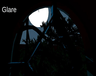
The monster blinds the main character for as long as he looks it in the... headlight, I guess. I don't think it's implemented very well. It would be better if the effect was more progressive, maybe it starts off as a lightly obscuring effect that grows in intensity the longer you are looking towards the monster. And instead of disappearing immediately as soon as you look away, the main character's eyes would take some time to adjust to the darkness again, with the blinding effect being reduced in intensity with each second.
Opening the doors is a chore due to the weird control scheme where you for some reason have separate buttons for opening and closing them. Whatever the reason for that, it just makes the game frustrating to play. So, if you just got rid of that and had a single Interact key, that would already drastically improve the gameplay.
The rooms you are opening to turn off the lights seem to be a great way to get a game over, since the monster can block the entrance and trap you there with no hope of getting out. Maybe they could become a safe area once you turn off the light switch/destroy the mirror inside?
The monster reactivating the lights you turned off as it walks by them seems interesting, but ultimately it's way too much, since you have to turn off all 21 of them. It could work if maybe there were less of them, but this way it just makes your efforts feel pointless. Some way to fight back against the monster would also be welcome, maybe the mirrors were supposed to provide a way for that, but they don't seem to do anything at this point.
The monster also seems to be way too relentless and there's not really a clear idea as to what you are supposed to do to survive against it. Running doesn't seem very effective and you can run into it easily since whatever signs that it is nearby are so subtle that you can miss them easily.
The main character's flashlight isn't very good. I don't think it's made correctly? I think a decent flashlight effect needs to be made from two separate parts in order to get a realistic flashlight and this one just seems flat and doesn't really let you see that much. I guess you should look up some tutorials on how to make a flashlight effect in the engine you used (Unity, I think) in order to improve it.
Other then the MC's flashlight, the overall presentation is decent. The main menu seems to be a placeholder though.
Anyway, good job! You have an interesting prototype of a game there. It just needs a lot of work, but it does have potential to be a good game!
Thanks for the advice! Going also by Bullhead Studios reaction to it the game does have a confusing narrative to it. I had plans on giving backstory during the game play but decided with what time was left in the jam I left it as is. The main menu and intro could use some work like you said. The mirrors were supposed to alert the monster that you were in that area since it just goes the same patrol route but was never implemented. You're right the flashlight was done with no actual testing but again with the lack of time and getting everything else to work I just did it that way. I was originally going to go without a flashlight and only using the lights leftover in the hallways to help you maneuver the hallways but it seemed it was going to be too hard to see the doors so you could open them. At this point it seems like the game would just be better without the doors and rooms and just the hallways with lights. For the light on the monster I guess I took the theme too seriously but what you said about how the light could work better does sound good. I'm assuming I can't update the game based off of people's feedback during the rating process correct?
You can update the game at any time, including during the rating period. The point of this is to get feedback and improve the game, so feel free to do that now.
Fun little game! Monster looks really cool!
Hey thanks for the feedback!
You;re welcome!
Interesting idea, but with little context as to why you're there or why you're dealing with the lights, leaves a little to be desired. Plus, the blinding light is more of an unfair element than a challenge in my opinion.
Wow didn't expect a video reacting to my game really appreciate it! The blinding light yes is a little much I agree. I didn't originally intend on having such a strong light but noticing one of the bonus challenges I decided to go with it. The doors being hard to open is like that on purpose to make it like struggling to open a door during a time sensitive scenario. I'm assuming you couldn't hear the audio coming from the monster so you could tell when it was getting close to you. There is a way to still walk straight towards the monster without getting blinded but you have to be looking slightly away from it while walking towards it. Give it another go if you can but again really appreciate the feedback and video. I also updated the description on the game's page.
Nope, no sound on my end. Couldn't hear the monster at all. Thanks for the context on the doors though, might check it out once I get the chance.
Also the rooms for the mirror are just a distraction in the beginning. I had more planned for the rooms but only uploaded up to this point. By the way in your video you can hear the noise . Sound of someone walking on wood.
Huh. I guess I thought that was me or something. Thanks for the insight!
Anytime!