Play game
Three Yellow Quartzes's itch.io pageResults
| Criteria | Rank | Score* | Raw Score |
| Story | #13 | 2.943 | 3.429 |
| Presentation | #16 | 3.311 | 3.857 |
| Creativity | #17 | 3.188 | 3.714 |
| Theme | #19 | 3.066 | 3.571 |
| Overall | #19 | 2.759 | 3.214 |
| Gameplay | #20 | 2.330 | 2.714 |
| Horror | #22 | 1.717 | 2.000 |
Ranked from 11 ratings. Score is adjusted from raw score by the median number of ratings per game in the jam.
How did you choose to implement the Theme: Thirst for Blood in your game?
That's what the protagonist, a vrykolakas, fears. In a symbolic but also very direct way.
Did you implement any of the optional Bonus Challenges, and if so, which ones?
Yes, all three of them. The second one and third one are part of a game mechanic whereby the protagonist has to drink from her flask - Or from human beings - in order not to collapse (And get a game over). The first one is the fact that the protagonists are a vrykolakas and an incubus, two types of vampires.
Leave a comment
Log in with itch.io to leave a comment.


Comments
I liked this game, but it was super hard to see. But I did enjoy what little I played. I am looking forward to finishing it, but I wish there was a full screen version.
Glad you're liking it so far!
To get a (sort of) full screen try this:
Hope it can help ^^"
Sweet thanks! I'll give that a shot!
So, I can't actually play the game again to review it more thoroughly than when I did while recording the video. It's bugging out after I start the game. I remember that this game had some nice visuals and some good story telling (though considerably excessive). The goals in the game seemed a little drawn out. It's not my cup of tea, but I can appreciate that this is exactly what some folks are into.
Um, what do you mean with "bugging out"?
Taken note of the "drawn out", I'll pay more attention. Glad that the graphics and story telling (even if massive) have left a positive impression!
Thank you for playing even if it's not your genre ^^
From what I can recall, it would show the window handle in the taskbar, but the game window would not show up at all. I'll try again today. Thanks.
This game has a lot of story going on. A very lot. So much that I had some trouble following what's going on. Jams don't give too much time for development, I understand, but there is so much text, it badly needs some cutting and rewriting to decrease its size without losing the meaning.
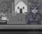
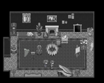
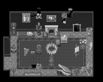
Graphics are a mix of usual RPG Maker designs and some simple hand drawn portraits. Understandable. Default RPG Maker font? Well that's unforgivable. It shouldn't be that hard to slap something different - some awesome fonts are completely free for non-commercial use.
Gameplay is a hit and miss - game would gain a lot if it wasn't about simply walking around aimlessly on flat scene with no perspective taking a wild guess which square on a grid means instant game over or not. It reminded me much about very early Japanese adventure games on fifth generation of consoles like "D" and "Doctor Hauzer" in that regard. Default RPG Maker game mechanics are very restrictive and don't really fit the game's aim that much.
Puzzles are sometimes overexplained, sometimes they are solved by deduction and sometimes you get lost and have to check every object in the mansion until you found the one you need. Thanks god there is actually a word-document with a guide inside in case if you stuck. The fact that all puzzles are rigidly structured in a form of "theater play" acts is making it much easier to comprehend.
Blood drinking mechanic is present but completely redundant. Just not press Enter while around silhouettes and you will get the best ending out of three.
While I can't say that this game is really good, it at least is not hard or obscure or puts a lot of obstacles in front of player (except for a tons of texts). As someone who played a lot of RPG Maker games in one's adolescence all flaws of this project are tolerable, and I actually kinda enjoyed it, but I can't deny that it would benefit greatly from the change of game engine and design direction.
First of all, thank you for the time you dedicated to play the game and write this comment, I really appreciate it.
Going by points.
The amount of text. I put "story rich" in the tags, but I think I'll edit the page to include "visual novel-like". I thought about your words, and I came to the conclusion that, at least for now, this wordy style is what I like best. Actually, I think here we're going more towards the rpg/visual novel hybrid than the simple "story rich".
The font part, I confess, surprises me. Maybe it's something more widespread recently? Personally, I've played very few RPG Maker games that have a custom font for dialogue (It's more a prerogative of Wolf games), so I hadn't even thought about the fact that it might seem "weird". I'll keep this detail in mind and pay attention to the games that come to hand.
As for the floor game overs, you're right. I've realized, both from your opinion and from others, that the holes in the floor are unfair and end up being more irritating than challenging. Theoretically there's a crack that indicates where the holes are but, in fact, if everything is broken and black and white, it's difficult to see them, if you are not the person who put them. Funny things is that I initially wanted to include among the features "Various ways to (not-)die", but I then decided to remove it because I didn't want to disappoint anyone who might be looking for a game like Witch's House. I suppose I'll reinsert it, also for the sake of fairness for those who don't want a game with so many game overs.
Regarding how to solve the puzzles, I too, with a clear mind, noticed that some things were explained to the point of exasperation. However, I don't have in mind the ones where you get lost and have to check everything. Do you remember any examples? (BTW, glad the guide was helpful!)
About sucking blood from people and the different endings. The game mechanic is "drink from [something] or "die"", because the thirst drops regardless as the minutes pass. You're not supposed to drink from people (Who, by the way, refill the flask twice as much). It's the point of the story: Clea doesn't want to drink from people and she won't unless the player pushes her to do so. Clea has no "game endings" to discover: if the player gives in to the curiosity to see the other endings, Clea has given in to her desire for human blood, and what follows has consequences. (To say that, I realize that this is definitely a visual novel thing rather than an RPG thing.)
That said, I'm glad that, despite everything, you kinda enjoyed this game! Thank you again for your opinion, you've given me a lot to think about.
Regarding puzzles:
Bloodsucking mechanics are just not really clear and you don't even realize that there is some time limit unless you will really look for it. I blindly poked every corner of the mansion for some good time and still got like half of my thirst meter full. If some death traps would inflict thirst increase instead of instant game over, and it was evidently shown - maybe then players would realize that they have some life resource. And maybe if characters mentioned that their time in other dimension is fairly limited - then that mechanic would make some sense to the player. Right now it serves more like a gimmick that nobody will notice due to factors mentioned above.
On text: even if your game is a Visual Novel - over exposition is still a poison to the flow. It is a good rule of thumb to cut about 10-15% of the text with every draft. Spreading the narration evenly is good for the pacing too. You need to keep things short to the point even with VN's. Switching from text dumps to some action and puzzle solving in even intervals is necessary to prevent players from losing the track of plot. Texts in games are like cholesterol in veins - it is good in small regular doses but spikes of it results in severe clotting.
Thanks for the list, it was very helpful! I've already fixed some things in the update. The idea of making the traps impact thirst is great! (There's actually one that does, but it's pretty hidden. I think I'll expand it to others as well.)
Regarding the names of the dolls, absolutely yes. I don't know why I decided to call them the same, it must have been madness.
The "Actually in one of the acts I had two girl dolls in my inventory and neither were of any use for that same act." however, should not occur.
You get the Igel's doll by finishing the recipe. Ery's is in the mushroom room. Areth's is in the room with the amulet. The room with the amulet is unlocked by finishing Act II, and Act II can only be finished with Ery's doll. This means that, when you have two dolls in your inventory, it can only be Igel and Ery (Act II) or Igel and Areth (Act III), and one of the two will necessarily be needed for the puzzle. Do you remember how you ended up in this situation? Did you have to reload an earlier save?
The cholesterol metaphor is wonderful and I will use it again.
Thanks once again!
Sadly I can't say all the details, I just remember that I had two dolls and none of them worked. One of them came from the cauldron and other I can't remember.
Okay! I'll look into it.
Per my son, "It was not scary. Like at all. I liked the presentation. It reminded me of my childhood games. You really did follow the theme good job. I didn't really get the story because I was goofing off like a llama on the loo."
Um, no, right, it's actually not that scary, except in a couple of scenes (maybe). ^^""
Don't worry about the plot, it's mainly "A bunch of dead people want to kill you and you don't want to kill a bunch of living people".
Glad that he liked the presentation and that it triggered a (kind of?) nostalgia effect. ^^
Thanks for the comment!
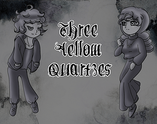
Great palette choice. Even though RPG maker games are not my thing, the b&w style makes the game very compelling and attractive. It's good to see how people use a tool like that and make it very personal and use the art direction to make it unique. Congrats.
It's a pleasure to know that I've interested and left a good impression on someone who don't usually play this type of game!
I thank you very much for your kind words ^^
Unique art direction and interesting character design. I liked how when moving throughout the rooms I never felt like the space was there just to be there. There was always something to click on and develop the narrative. The animation of her hair during the walk animation was really good it is a subtle sway but really nice.
Feel the stories symbology could be better explored through gameplay. There is lots of trios in there between the stones, apples, sisters and figurines. I entered two rooms I feel should of contained a story beat but didn't find one and it kind of took away the incentive to push on.
Oh and the music during the bench dialogue was a little up temp and loud for my liking.
I definitely feel there is the foundations of something really good though and enjoyed the playthrough.
Thank you for your words, especially regarding the sprites - I liked making the hair move so much that I toyed with the idea of making the protagonists bald, so it's very satisfying to know that they left a positive impression.
About the "two rooms", I assume you're referring to the mushroom room and the destroyed room, right? If so, you're absolutely right. I left there only the essential things for time reasons, so it's very true that the rooms are empty and can leave you perplexed (Especially because the rest of the Villa is accompanied by a large amount of text). But I hadn't thought about the "gameplay" part: for me, all three sisters have a single main puzzle (the show, the recipe and the labyrinth), but I hadn't thought about how strange it seemed to have the rooms of two sisters separated from their puzzles. Thank you for pointing that out!
Sorry about the music. ^^" The idea was to give a very clear sound difference between Clea and Aurel.
Thank you so much for the feedback and the encouragement, I'm glad you enjoyed it!
My pleasure
Very cute and compelling story. I love the little bits of lore, such as the bit about counting small numerous items :)
Glad you noticed it!
Thank you for your kind words, I'm happy you enjoyed it ^^