Play MOSAIC Strict card
The Beast's Home's itch.io pageResults
| Criteria | Rank | Score* | Raw Score |
| Should this be included in Tiny Library: CCG? | #8 | 4.167 | 4.167 |
Ranked from 6 ratings. Score is adjusted from raw score by the median number of ratings per game in the jam.
Leave a comment
Log in with itch.io to leave a comment.



Comments
I would love to include this! You just need to complete an agreement at this link: https://forms.gle/oqb528vYvbW3AciM6
I'm sorry, I thought I had! Done!
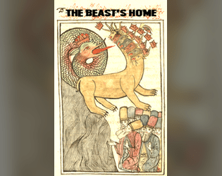
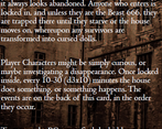
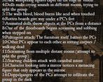
This is very cool but I don't know that it's going to be legible when printed as bridge card. I suspect the font is too small.
I've used smaller and it's been OK. That said, I can't be sure until it's actually printed. Some fonts are better than others for small print.
I don't know what the font sizes are because I have an older version of Affinity Publisher and can't open your file (are you on V2?) but the front of the card is pushing the boundaries of the smallest. The back is going to be too small with its font size and leading (and the dark background), except for people with extremely good eyesight.
(I say this as someone with decades of experience as a print journalist. Nevertheless I voted yes because I really like it.)
Thank you! And yeah, I'm not really trying to argue; it's the best I could do at the time. I'm using V2, yeah, and I'm 200% a hobbyist / learner when it comes to layout. Thank you again for looking at this, and for the feedback!
Sorry - yes. Wasn't trying to argue either. I got my first two packs on Friday and when the cards print well they are so cool so I want everyone's cards to print well!
Sans serif typefaces work better at small sizes. If you want to put white/light text on a black/dark background the rule of thumb is to step it up a size and/or boost it slightly with a thin border, although that border trick won't work well with a serif font when it's too small because it'll just turn the letters into blobs. Increased leading also helps but, of course, then you lose physical space.
One I use is Carlito (https://fonts.google.com/specimen/Carlito/), although I don't use it that small, but you can try Neue Helvetica if you have access to it or Nimbus Sans L (https://www.fontsquirrel.com/fonts/nimbus-sans-l).
Hair raising!
Wonderfully creepy in all the best ways!