Play game
TryAngle's itch.io pageResults
| Criteria | Rank | Score* | Raw Score |
| Simplicity | #4 | 4.100 | 4.100 |
| Fun | #5 | 3.500 | 3.500 |
| Visuals | #10 | 4.000 | 4.000 |
| Sound | #11 | 3.500 | 3.500 |
| WOWIE! | #15 | 3.200 | 3.200 |
| Creativity | #25 | 2.900 | 2.900 |
| Topic | #46 | 1.800 | 1.800 |
Ranked from 10 ratings. Score is adjusted from raw score by the median number of ratings per game in the jam.
Leave a comment
Log in with itch.io to leave a comment.


Comments
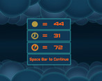
Great job! The game looks and sounds great, and I am a sucker for competing with myself. I'm not sure what all of the numbers at the end mean though, so I wasn't sure if I was doing better or worse at times.
Thanks for playing my game. After getting some feedback, I have decided to make a post jam game. It will have multiple levels, better speed system, player on the left, and more object interaction. After reading your feedback I have decided to put in a icon explanation screen. Thanks for your feedback.
Played your game! I really like the design and gameplay. More levels or an endless version would be cool
Thanks for playing my game. I'm glad you liked it.
After getting some feedback, I have decided to make a post jam game. It will have multiple levels, better speed system, player on the left, and more object interaction. Thanks for the feedback, it helps me and the game a lot.
For a first game jam game definitely very well executed. The colors a gorgeous! Looks very nice. Also I like the score screen at the end (and the UI in general).
The player controls feel a little weird (not very smooth) and the player character should definitely be on the left side of the screen, so you can see more on the right! The amount of speed you get from a speed booster is a little insane. :D
Well done. Good result for 3 days.
Thanks for playing my game Jonas. I'm really glad you liked the colors. I followed your advice on picking a color scheme to mesh everything together.
Thanks for your feedback! After getting feedback, I have made some changes to the game. The post-jam game will have the player on the left, slightly smoother controls, moving objects that interact with each other, and multiple levels. I'm working on it right now.
Also thanks for hosting this game jam. I wanted to try a game jam, but didn't think I could do it. You made me believe I could do it, and I'm glad I did. I never expected to make a great game, I just wanted to finish a game. So I completed my goal, and learned a lot along the way. Again thanks.
I don't think it fits the theme very well. There is only interaction between the player and the other objects, not between the other objects on their own.
Thanks for playing my game. I suppose you are correct in your criticism, it doesn't fit the theme very well. This is my first game jam, and I have learned so much. I now have a bit more understanding of theme interpretations, and hope to get better next time. Thanks for your feedback.
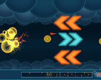
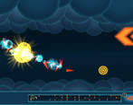
I liked the game. The minimap is very cool. It would be nice if you add more levels in the future
Thanks for playing my game. Glad you liked it. More levels would be cool.
I like the minimap - which is kind of necessary to do any good at all at it. I think the player's character should be at the left of the screen, which would give us more time to press the right button for movement. Also, have you thought about having the player remain in the middle by default, and return to the middle position when W or S is not pressed? The player would have to hold W or S to remain in those positions. That may fit the style of the game well.
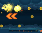
Agree to these points. Also I like how you use the coins to guide the player.
First off, thanks for playing my game. You have some good ideas, for further development. I really like the idea of a dynamic camera that reacts to input.