Indie game storeFree gamesFun gamesHorror games
Game developmentAssetsComics
SalesBundles
Jobs
TagsGame Engines
(+1)

That was cool! The concept is fun, and the setting is interesting. There were also some neat precision platformer bits.

That said, with all due respect, I feel like the level would still be a good level of hard (and long) if the platforms merely regenerated after a time (or if there were checkpoints). Mandatory beginning restarts feel quite artificial, especially given that the level is already quite hard.

However, I will say: I appreciate that the part at the end of the level was NOT the hardest part! That's a good design choice.

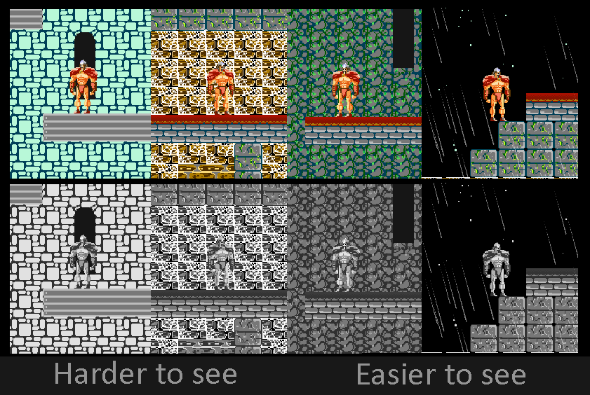
The art has a distinct style, and the Conan-esque character design is quite charming! However, there's one problem I have with the graphics: a lot of the background tiles have a similar saturation and value compared to the main character. This isn't universal (the mossy stones in the 2nd layer have a good contrast), but it happens often enough to be somewhat straining to the eyes.

Good job including audio control! Unfortunately, it seems that the menu button hover sound always plays at max volume.

Good work!

(+1)

Ooooh yes! Feedbacks! Love it!

First of all thank you very much for finish it we know it requires time and a lot of retry.

Like you said it was intentional that the last bit was easier.  Glad you appreciate the design. Speaking of it: in 3 of the 5 screen/floor there are 2 "course", one simpler than another ;)

That said we feel it wasn't fair to the player to make him face a even bigger challenge at the end after all of that.

If you, who reached the top and found out that the level is not that long, still think that respawning platforms and checkpoints are needed we take that feedback in consideration for future improvements. We already have ideas for that.

Coming to the values: we had other colours, an entire other palette. It didn't convinced us so we decided to use NES palette instead. But this choice was made 2 days before deadline and we found ourselves rushing through the process. Usually we do the greyscales  to see the values but this time...

Yeah you have a point, we definitely try to improve the colours to make The Hun pop up!

Thanks again for the precise feedbacks, we are very pleased that comes from you because we love your work ( we found you like 2 or 3 weeks ago and we liked to play your games: Make a friend, Logic Bulb adventures, Crap and the others).

(+1)

I'm pleased to hear that you enjoy the rest of my work. Thank you!