
Indie game storeFree gamesFun gamesHorror games
Game developmentAssetsComics
SalesBundles
Jobs
Tags
(+1)

Considering this part of a trio of May Wolf submissions, I can't help to compare Worth More Than Words to the other two entries by the same dev. I think I can safely say this was my least favorite (which, considering this was the first one they wrote, is a good sign, it shows their growth!).

First of all, I must say that while the VN has some good art, Josiah and Winston are somewhere in the uncanny valley for me? Mainly because of their big eyes staring directly at the reader. The sprites staring at the reader while talking at each other do not work in WMTW, while it sort of worked for me in The Awakened.

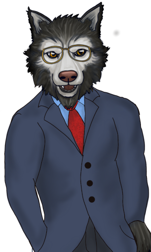
Timothy, on the other hand, looks cute, I think he incapsulates the idea of aged wolf pretty well!

SPOILERS to follow.

The core of the story, the part where Timothyr rambles about his youth, sort of works for me. You can tell this story comes from a real place, the music is nice, and the very long monologue sells the idea of an old person rambling. Despite that, it kinds get tiring and monotonous after a while. I really wish there had been some more interjections by the son and some more physicality in the scene. Both the title and the way the story is handled seem to point to the relationship between the dad and his sister being the emotional core of the story, but that never really materializes. I think it's significant that the father shares this experience, but the real emotional core of the story, the one we get to actually experience, is the relationship between the father and his son, in all its complexity. I wish it had been developed a bit more by making the son a more active presence.

Aside from this singular scene (that eats most of the VN's wordcount) everything else doesn't really work for me. The framing device with Josiah and Winston doesn't really do much (except telling us how the story with the dad ends, which could have been shown in a more interesting manner). The vignette with Timothy and his sister is shown at the beginning, where it has no context, and then has to be awkwardly repeated a second time with context in order for the emotional beat to land. And the random frontal pics after the end of the story really clash with its tone.

(+1)

I agree.  I added the scene at the end due to some confusion on my part.  Based on a couple of joke comments in the forums, I thought it HAD to contain NSFW, and I couldn't figure out how to shoehorn it into the story, hence the after credits, because I knew it didn't belong there.  It wasn't until later that I figured out this wasn't the case, but by then, I had already released it and wasn't sure if people had already been judging, so I was afraid to change it.  Come July, that's the first thing to go!

As far as sprites go, they are in the uncanny valley.  I tried doing the eyes several times but kept having trouble with the results.  Since we were supposed to use new sprites, I decided to take the opportunity to try a different lineless style with varying results. Still, I wanted it obvious I hadn't just recycled what I made in late April for my other project.  It was also my first attempt at learning to use layered .psd files to make expressions with moveable components - the ones I did before by erasing and redrawing parts of the face.  That's why they were all facing the camera directly, as I felt it would be easier to manipulate the expressions, but I've learned how to do some better throughout the game jam.  I'm still a beginner in the drawing department; I only recently got a tablet with ProCreate, so I started messing with it around the beginning of the year.


After the game jam, I plan to switch the sprites to the familiar ones with different clothes to make it integrate better with the other story.  I will probably add some outlines to make the old wolf match, but it should be easy.  I also plan to add cutscenes to further break up the monologue's beginning.  I had made some, but debated on whether to use them or not.  As it turns out, I guessed wrong : )  I wanted them to come across as the son imagining what his father was talking about, hence the crude, chalkboard-like look of them.  (I never finished the second one, and a couple others were unfortunately overwritten by accident).

The painting over the fireplace was also originally meant to be a cutscene background, but I recycled it, since I had already taken the effort to draw it.  I was daunted then by the prospect of drawing a full family of 16 wolves before I came up with the silhouette concept, which i also ended up scrapping.  Now that I know how to do simple frame animations in Ren'Py, a two frame animation with a more chalky brush may be a nice touch to add.  I had lots of ideas, but not a lot of focus or experience.

I even had thought about going the photo background route.  As this is based on my father's real life experiences, I have old photos of most of these places already, though I would've had to photoshop the people out of them.  Unfortunately my computer with my old copy of Photoshop CS5 died on me back in March, so I've had to try and get by with GIMP, which I'm not at all familiar with.  I also prefer not to use real photos with drawn sprites if I can help it, as it rarely looks cohesive.

Every one of these projects were full of experiments, hence the different genres for each.  I also didn't start using Ren'Py until after the first week of May, so a lot of my effort also went into learning the basics,  I know all of these stories were quite rough, but I appreciate you taking the time to read through them and provide comments.  Hopefully I can use what I've since learned to improve going forward.

(+1)

Of course, we're all here to improve! It's already plenty impressive you managed to write three stories in the one month.