On Sale: GamesAssetsToolsTabletopComics
Indie game storeFree gamesFun gamesHorror games
Game developmentAssetsComics
SalesBundles
Jobs
TagsGame Engines

Thank you for the response and great to hear that you are already working on these updates.

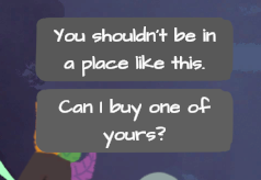
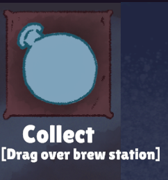
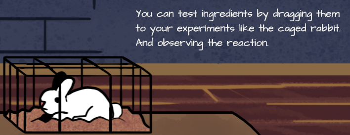
I was running Fullscreen on a 1920x1080 display. These were the fonts that were (just a bit!) difficult to read for me:

For the fourth, it's the squished together brackets part, not the "Collect" :)

(+1)

We do want to keep the stylized fonts, but we'll reorganize the UI to display more text cleanly and truncate descriptions in some areas to allow for larger font sizes.   Tutorial text will be given its own tab while the dialog options will take more space.  Thankyou for the screenshots, they're very helpful.  Stay tuned!