Alright, here are my notes:
(they will probably sound quite negative, but that's because I focus on the things that should be fixed):
- FPS cap should include higher framerates like 165, 240 and 360 as such monitors exist (mine is 240hz so this may make the game feel stuttery)
- Main menu is cool but I'd like some button SFX.
- You don't need an FPS counter for 2D games.
- For earlier levels, you should make jumps more forgiving. Hard jumps early on just mess with the difficulty flow while the player is learning new mechanics (like the scrolls)
- I would add an SFX once a scroll recharges. It would be a nice indicator.
- Lighting-wise I would add a light to the player. The game feels really dark most of the time and lighting the area up around the player would help a lot.
- I like this foggy effect you tried to make, but you should have the texture move around in some way. It's not bad when moving, but when standing around it becomes very static.
- In the 3rd level (double jump scroll), you can very easily miss the scroll and get to the end of the level.
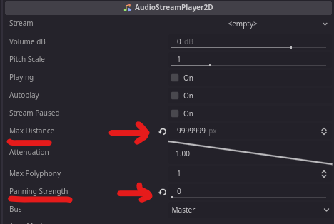
- Music has panning and distance attenuation. You can either make the max distance of music really large or attach it to the player.
- In level 4 my "R" scroll sprite disappeared.
- I used speed and got hit by a spike. After respawning I got yeeted out of the dungeon and into the void. The game does not have a reset button so this softlocked the game.
- Please nerf that jump in the 2nd level, it's way too hard.
- Level 4 needs some arrows or something to indicate where to go. There are a ton of blind jumps and that's not a great experience.
- I got to the last jump of level 4 (which was another blind jump) and I died because I used the wrong scrolls. This lead to the same softlock I mentioned before. I proceeded to ragequit the game afterwards.
- The scrolls were a bit "wonky" to use. If I have 3 scrolls and I choose to switch one, it should only switch to the one I don't have in my hotbar, which is not the case here.
- Sometimes the combined scroll abilities were inconsistent. Like double jump + big jump gave me 1 large jump and a small jump afterwards.
- To fix the double jump not giving you proper height on the 2nd jump, just reset the velocity.y if the player is going downwards.
Most jumps in this game are way too hard. One tip I have to avoid this in the future is to design the levels in a way that it's easy for you to beat. If you (the dev) is struggling with jumps, then it's nearly impossible for the average player.
So all in all, this is a game with a messed up difficulty curve, but easy to learn mechanics. The level design needs more work, especially in eliminating blind jumps, and making regular jumps more forgiving.


