
It's not about why you need a fullscreen but about others need it :) you might be completely fine playing the game on smaller screen/resolution but why take this opportunity from others if they wish for whatever reason?
6matko
143
Posts
8
Followers
8
Following
A member registered Dec 02, 2023 · View creator page →
Creator of
A game where you are playing as AI Chat bot and answering user requests.
Adventure
Play in browser
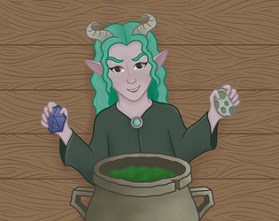
Game about ferret alchemist trying to escape goblin dungeon
Platformer
Play in browser
Recent community posts
Math and Guns Jam Version jam comments · Replied to SubLuminary in Math and Guns Jam Version jam comments
Its awesome to hear that you are loving the game. Never played Ultrakill but if you want to continue the shooting aspect then maybe you can spawn "numbers" on the map which players can pick up as an input for answers. Maybe this will help UX a bit. Hard to tell. I'm sure you'll figure out something :D
The game is interesting and loved the hidden items with humor. I think you made a nice theme interpretation and with all the art it looks great. I didn't enjoy the "wall slide" mechanic tbh :( It felt strange. Like the idea itself sounds great but I had difficulties moving and I didn't find it "responsive" or even intuitive. Given the time frame I'm even amazed you went for it so kudos on that. I certainly felt myself like in a retro game with some box breaking mechanics (Half Life association) and wish there would be some visible "dropped" items after breaking and a little bit of quake association. The enemies and the pace reminded me a bit of another game I really enjoyed - Eldritch. Vibes and mechanics are similar. Credits screen was awesome, loved the idea of throwing boxes. I think it was a very creative way of doing it. Overall I like where you are going with this idea and you did amazing work so far. Ofc there are the deadline limitations and for 2 weeks thats really great stuff. There are definitely areas to improve and I think with more experimenting/changes you could get to a really solid and fun product that can eventually land on market (Thinking about "Eldritch" game right now).
P.S. Cool inspiration by Babymetal & Electric callboy. Completely forgot about that line. Sad that you couldn't use their music in the game :<
Love the idea you came as a theme and the aesthetics are great. I think its very unique and unexpected which is awesome. Loved the "Defense" sound, it was super cute. The art was also nicely done, creating a nice cozy atmosphere. As for gameplay, unfortunately I didn't enjoy it much :( The game felt slow, movement strange and some predators insta killed me without even option to do something. I was questioning defense mechanic at this point. Not sure how well faster pace would be in this type of game but maybe you can think about other ideas how to change something which would be both challenging and clear to the player (Might be just skill issue). I also couldn't figure out what to do with XP and how to upgrade (if even possible).
Regarding the pixel art I wouldn't be able to tell it was your first time making pixel art if you wouldn't mention it. Sure there is place for growth but I mean, it is done so well that its hard to tell you never done it before. I guess its a good sign for future improvements and that it will become even better.
P.S. Maybe its a good idea to allow fullscreen on itch page so we can turn the game full screen?
Nice theme interpretation and game idea. It so happened that I saw similar gameplay in another game but in your case you add extra features like dashing, limiting the area and giving second chances with HP which is super cool and I think is the best decision. The next thing I want to mention is UI. You are absolutely right of being proud of it, its amazing. Probably the best UI I've seen out of all games that I played for this jam. Its simple, readable and yet interesting & fitting. Everything is so smooth and well designed + all the transitions. Can go long with the praises. Really awesome work with the game. Can't wait to see what other UI/UX you will make in future.
I can say for sure that between all games submitted that I've played for this jam - this is absolutely my favorite. It feels like a really nice demo which reminded me of Distraint. Played both the endings and the theme interpretation is nice. I only wish it would last longer. It was that good that I wanted to continue playing, awesome job. Understandably, given the time frame you did best you could but in the end where the "ending story" was, would wish for more visuals and interactions but even with this approach you managed to create an immersive game and thats the main thing I loved about the game. Art, SFX & music were executed perfectly IMHO. Especially the audio part was giving such a nice immersion. Another thing I can mention is great font selection. Readable & fitting. That is one of my main comments for other games that either there is a default font that usually doesn't fit or it is barely readable. Massive kudos to the team for amazing work, I really enjoyed the game!
UPD: Possible small UX improvement that could be added is keeping the objective visible at all times. You already have great transitions and show the objective "loud & clear" but then it fades away. Maybe instead of fading it could be minimized and stuck somewhere at the corner just so that the player can always get a glimpse of what is the objective ? Like a small non intrusive note.
Aesthetics and simple gameplay make this a nice little skill based games. Reminded me of similar games that I used to play on phone and was addicted. Great thing is that you still have plenty of room to grow and add new content but the core game loop you already have and it is great. Good job even with all the distractions you had :)
Sorry but I didn't quite understand what I have to do :( Was just running around collecting soap, left & right indicators were changing but no clue what they meant to represent. I did like the music tho. As for the first game as a programmer think you did really good job and sure learned a lot. Keep up the good work.
P.S. I got suggestion to enable "Allow full screen" on itch page and want to suggest the same thing to you too. I didn't find option to enable full screen.
Very great take on the chess game. I think you managed to add a cool twist and works wonders. Good amount of replayability value and the art looks great. IMHO, the art is one of the main things that makes this game great and compliments the gameplay. The music choice is also great. Overall great job on the game, think you have very solid chances at being in TOP 10 and the fact that you made it in scratch is a living proof that desire is the main factor. Hats off.
Cool idea of adding math solving into the game. Keeps your brain working while playing. Unfortunately didn't enjoy it at full because switching focus between running & text input just takes too much time and if you made a mistake its almost GG. You will have to think more about how can you improve the UX for the player. Maybe even changing the mechanic of real time top down shooter mechanic onto something less "real time" like turn based or something? There is room for growth and hope you will come up with something that will work better.
Interesting concept and implementation. Loved the cut scene at the start but wish there was some music or SFX during the dialog, felt very empty. The gameplay was interesting and monster variations were great. The only thing I didn't like is that weapons disappear pretty quick (From comments found out that you can tap SPACE to make the timer reset but thats unintuitive) and that it takes forever to pick up new item. "Progress" or "Time" bar is hardly visible. If you would change the color to something more bright I think it would be a lot better. Another thing I would wish for is that dialog boxes would be styled a bit like custom font/borders/bg color/etc... I am assuming that you just didn't have enough time to polish it all :) Overall the game is interesting and has room for growth. Great job!
This was an interesting concept and the music reminded me of SEGA games. I wasn't a fan of the "turn based" movement but I have to admit that it was an interesting decision and overall added some puzzle elements to the game which is a nice twist. Your daughter did awesome work on the art :) From visual aspect the game felt like a single consistent unit and accompanied with retro music felt nice.
There are a few comments I would like to point out for possible improvements:
1. Your buttons blend in with the background/game on the main menu. Would be better if the background was less visible so the button would hold more attention (call to action).
2. Scaling was a bit of an issue. You can look more into it by setting correct Stretch mode & Stretch aspect IIRC. This is not a major issue but would make your game look better.
3. Don't be shy of using custom fonts. Minimal effort but correct font can greatly improve presentation of your game. This is mostly for UI elements & instruction popups.
Hope these will be helpful and you had fun working with your daughter :)
Amazing work! From idea to implementation - awesome. Great job guys. I absolutely loved the visuals and aesthetics of the game but gameplay was similar to fruit ninja so it was easy to get going. The upgrade system also looked very clean & appeared just about the right timing - not intrusive and intuitive. The BSOD screen was magnificent. Background noise was such a nice detail to it. Overall I think its really awesome game and hope it gets more recognition because this level of polishing is awesome, respect for that. I don't remember when exactly, maybe before upgrades there were small game freezes. Nothing critical but noticeable enough.
That was a really nice, chill puzzle game. Great job. Loved the visuals, art and music. The idea itself I think is very creative and I loved it. There were a small visual/processing bugs between transitions but those are minor and don't take away anything from the game.
On a more constructive feedback:
1. Some objects are a little bit out of place. For example, crystals or objects on floor and wall feel like more detailed and they stand out. Maybe that was intentional decision.
2. Sometimes it was hard to get into "another item". Maybe some highlight could do the trick, especially when you can jump far enough. If you will miss the jump then there won't be any highlight. This should improve UX.
I have very mixed feelings about this game. Its has an interesting twist of doing "style kills" but felt like it was built by mixing various different things and gluing it together with duct tape. Its working. Its playable but everything is so out of place. How did you come up with this strange reloading mechanic ?
P.S. At least you had fun making it 🔥🔥
Thats an interesting approach on Tower Defense and the theme. I like how you tried something unique with perspective (at least to me). Unfortunately with that my praise ends :( One of my commons comments is about font readability. I had no clue what buttons I'm pressing in the game and what actually is happening. No music also was disappointing. Was expecting to listen at least to something while "action" is happening. I haven't seen that its your first game and have to say - great job on the progress. I'm sure you learned a lot.
You managed to create a nice and fun "time killer" game, great job! I enjoyed playing it and it was even relaxing :) Only thing that I might've wished for is for some sort of SFX and/or visual when you get hit. I suppose that health bar under the boulder ? If so, it was decreasing and I didn't even notice when/how.
Loved this. On top of fun gameplay you also used asset pack that Iove and in the end you have a really nice looking prototype. There were a few small bugs and performance pitfalls but overall game was very addictive and fun to play. One of the pitfalls was that for the first upgrade the game froze a bit and thats probably because you were loading those upgrades. I think you would need to preload those resources earlier or maybe on game start. There are definitely more information on the internet. But the UI screen with upgrades looked great, loved that that it was "alive" rather than static. And the cutscene at the beginning was also a really nice touch.
The game is super nice! Awesome job. From concept to implementation. There are a lot of elements that I really liked and it was fun. Think you nailed it with idea, mechanics and art. Honestly, don't even know what can be improved but I was satisfied after playing the game and I enjoyed it so it should also indicate something :)
Thats an interesting take on a theme, I liked it. I think you have a great proof of concept here. Might be my skill issue but I felt pretty limited in my actions and the range attacks not working to my favor. As someone already mentioned, cancel option would be a great QoL improvement. I liked the art and SFX. Great job on the game and there is definitely room for growth & new features.
Hate to be that guy but to me the game was boring :( I'll explain why but before that want to say that you still delivered a good and playable game with some interesting things that I liked too. I will try to express everything I felt during the game:
1. When starting the game I thought what a nice and interesting UI, great job on that.
2. When I viewed the credits screen I clicked on one author, it opened a new tab but then started the game immediately. Probably just a small bug.
3. The art and music are great but one thing I disliked a lot was the font. Even on full screen it was hard to read. Besides that the dialogs were nice, had a moment of VN feeling and they worked as I would've expect, so thats awesome.
4. Was fun to see the art work and the implementation once you are in the game. The minigame was quite alright but what I think should been done better is to keep "Spinner" at same position and probably just above your sheep player. Otherwise it was very frustrating looking for it on screen, especially when it blends in with everything else.
5. It took me some time to understand what I actually have to do and the whole process was boring - Hit space at the right moment and run to some sheep. Repeat. I didn't understand why the sheep counter is not increase and then saw that sheeps also have "progress bar" that I need to fill in. I almost quit on that moment but decided to see what is going to be a reward. Unfortunately my reward was 1/15 rounds. At this moment I knew I don't want to do it anymore. Maybe its just not the game for me and thats alright.
6. The art at the end of game session was awesome, loved it.
7. Overall I felt like a mix of VN, some mixing combinations and a boring (sorry but thats how I felt) minigame. Maybe the game could improve with more focus on VN & quicker minigames because as a VN game it has some potential and mini games could add a bit more player involvement.
Hope you can use this feedback for some new perspectives and maybe even updates.
Thanks for playing. Timer was mostly an experimental thing and I do agree that probably it would be better without it. For that reason at the end I made an option to start the game with longer timer. Fact that your timer went down is interesting. With all my testing I have never seen it. Can you recall maybe you did something specific or you remember in which situation that happened ?
That was incredibly fun game to play. Love the artwork and the idea. You did a great job on level design too. The only complaint I have is during dialogs I would naturally hit space bar to get all text revealed instead of waiting for word-by-word appearance but that action skipped the dialog. Would be better if spacebar would reveal it and in the end "Hit spacebar to continue" would appear to explicitly confirm that user is done reading. Everything else was great, good job.
I love that this game is both addicting & chill. I don't have much experience with survival style games but usually they tend to punish on death which is logical. Its awesome that in your game once you die you still can continue the game and how you implemented it (both visual & idea wise) is great. The art is another thing to talk about - it has unique style fits with everything so well. I think you did a really awesome job on the art & design part. Special kudos for making nice progress bar at the top that is both visible and no intrusive, love it. Its usually one of my complaints for games that some elements take too much attention but in your case you managed to keep it clean & simple which is perfect. Another complaint that I usually have in similar games is how the upgrades appear. Sometimes they just immediately pop up, you accidentally click something and then continue. You handled this case perfectly - You have a quick yet smooth transition and you are not allowing player to make a mistake. Instead, you require explicit input (1, 2, 3).
Overall I think you did a really great job on the game and even in this stage it can be enjoyed more than some of the "full release games". I can give much praise for different elements but hope you get the main point :)
P.S. There was one minor bug - Enemy spawned inside the crystal but it was able to get out of it.
Thanks for your comment and for playing the game. Yes, the goal is to earn bad reputation and in the end you are presented with the score just to indicate how good you were as damaged AI. The calculation is kinda hidden information for the player but maybe reputation and token changes could been made more clear to the player, I agree on that. Otherwise yes, the game is just the same but each answer could lead just to other options. Some answers may lead to more questions and thus give you more options to damage rep :)
I have so much mixing emotions about this 😂 I'll start by saying that I DID enjoy the game and I did have fun but there were some moments that left me uncertain. I still have to remember that it a game jam version so don't take my comments too serious :)
1. I always look at details & UI closely so I can't not notice that during the intro (red text on paper) you have standard font which looks so out of the whole aesthetics. Possibly it was a last minute change and then its understandable.
2. I did love the intro game with instructions but would love it even more if it was more forgiving (time wise) or ink wouldn't run out during that level just to give more time to player to adapt. Another thing which would been better (IMHO) is font selection on the floor. The idea of blood stains is cool but while your time is running and you try to figure out how to play, how to get yourself out of the wall its hard to focus on text that you need to put effort into reading. If those instructions would be more clear then the problem would disappear.
3. Slowmo was awesome, loved the effect. Wish it would last a little bit longer to give more satisfaction. I felt like it ended too soon.
4. When I was in the office levels than I got stuck in multiple different furniture although level before it I kinda could go through it. Basically a better understanding of surrounding what to avoid (where you can get stuck) and where you can actually fly. Maybe even make areas a bit bigger to give more room for maneuvers
Overall the concept & movements were awesome and fun. With some improvements it can become even better so I think you really did great job, especially within the gameplay aspect.
Well, that definitely its in the theme xD I think you did an incredible job with this game. Yes, it is very raw but the idea is amazing and the fact that you have rooms with different layouts is awesome. I can agree with other comments that this felt weird but not in a bad way. Hard to say anything because it was done only in 2 weeks and thats amazing but it definitely needs more polishing to better understand where it is going. As a primarily mechanic I think its awesome but the movement wasn't to my taste. I would enjoy better with quake style movement but take it as a personal preference rather opinion. Definitely a good work.
First things first, I couldn't access you GDD. Maybe its not made public and I think you would want to check it :) Try opening it in incognito - if you can, all good.
Then about the game. I like that you went with custom art work and I think that the sword in the stone looks the best. I want to keep my opinion honest in hopes that it will help you improve so don't take it personally.
1. So the idea is interesting - you have to resist and to do that you have to keep pressing certain keys. Simple but working mechanic, although I'm not a fan of it. What I was missing here is understanding am I clicking the right key, when to switch, how much time I have, am I winning or how close I am to winning. Those kind of little things that just gives player understanding about the situation.
2. The first red flag to me was loud strange music selection. To me it was loud & annoying. So first thing that you can do is make initial sound a bit quite and player can adjust it later (Even if you don't have it then better to keep the value low as player can make headset louder if required. Worse scenario is opposite - you start the game on normal volume and then get your ears killed)
3. Another thing is the "Game screen". I had issues figuring out what I need to do, what is this strange text and why is it weirdly stretched. My advice would be work a bit more on the font selection & readability. Also please keep in mind about the slow readers like myself who don't like when you show the important text to them and then start something without any confirmation. Adding a simple button like Continue/Start/Press "space" to start would solve it.
I think if you work on these points and make the game more accessible/understandable to player you will have a completely different player experience. Its awesome that you made this game and it is actually playable. Next steps would be polishing which you can pick up after the game so good job :)
The game gave me vibes of "TowerFall Ascension" game. As many mentioned, colors and VFX juice of the game look and feel amazing, awesome job there. Like the overall experience and game is fantastic but there are some key moments that simply didn't allow me to enjoy it at full:
1. Font is terrible. I barely understood the writings and Q (as one o the controls) looks like O which can get confusing. I'm sure there are better pixel art style fonts that are more readable
2. The screen size was small and everything was so close to each other. IMHO, would've been a lot better if the play are is bigger and everything else smaller. Similar to Towerfall. I think their proportions are great example.
3. As others mentioned, the controls were odd, I agree with that. Had to spend some time to get used but still had minor flaws. On controller I'm sure it works better.
Despite these things I can imagine this game being a nice coach game with some minor improvements. Its already pretty polished game so props on that.
Agree with other comments, checkpoint system was the most important one. Besides that the I loved the immersion. Some games require bg music but some are better without it. Your game goes perfect with minimal SFX and the art work just compliments it. You made a really fun and challenging game which is awesome. Special kudos for "tutorial" and the ghost actions (if you can call them like that) that show what is supposed to be done. Awesome work.
I remember playing this game in a bit earlier stage and this version is great. Love that you improved the UI (although I would make XP even more transparent/smaller). Overall game gives vibes of old flash games - UI, SFX, gameplay and its not a bad thing. UI in general is great, loved the small animations and overall look. Somehow SFX sounds really satisfying. Unfortunately there are a few things I would like to have:
1. Player progression feels useless. I don't receive anything on lvl up, I don't get flashy lights/VFX or even a sound effect on lvl up. I think it would be better if lvl up would feel more special.
2. I saw in your GDD that you would like to have classes and abilities. I think that could indeed make a game a lot better & interesting. As of this stage its nice to kill a few slimes (which is satisfying) but thats about it.
3. Understandably its a prototype in two weeks but if you decide to continue, to me it would be nice to have some sort of goals or milestones to make my actions more meaningful (Settlement was saved popup/screen or some sort to mark that I have reached it and now can continue to next one).
I did enjoy the difficulty progression. I think it was done great. Slowly but surely monsters become stronger without extremes. All in all its a good game with room or growth so great job!
SMoC: Self-Modifying Claymore jam comments · Replied to KelvinHM in SMoC: Self-Modifying Claymore jam comments
The game is very clean & polished, loved it. Not to take anything away from the game and the effort but its just not for me :) I loved that the timer is not super aggressive and I could sit down and think about it but still too complex for me (skill issue). What I understood is that this game would be perfect for learning circuit boards and how they work, how amplifier (etc...) work. Honestly, I would like to learn it in a game form (which this game actually does to some degree). Removing my personal preferences aside, I think you manage to great a very solid puzzle game with enjoyable art, UI, music & SFX. As I said, the game looks polished and maybe even on Demo level.
Hey, thank you so much for such awesome comment <3 I can agree that explicitly telling what is the goal would be nice. I think its not the first time I made this mistake :D On the other hand it didn't bother me because at the end you still can do multiple playthroughs and would enjoy (hopefully) the dialogs :)
This is one of those games which I tried to like but I couldn't :( There were many bugs that caught my attention and even crashes (Try spamming Q while there is food to eat). The idea as a whole is awesome and that is definitely interesting take on the theme. As others mentioned already, the controls feel clunky to my personal preferences, I was missing any goal at all. I understand that it was a sandbox type of a game but it was just too boring for me. The city looks great. I imagine it would take much time to compose it. Special kudos for the name, love it.