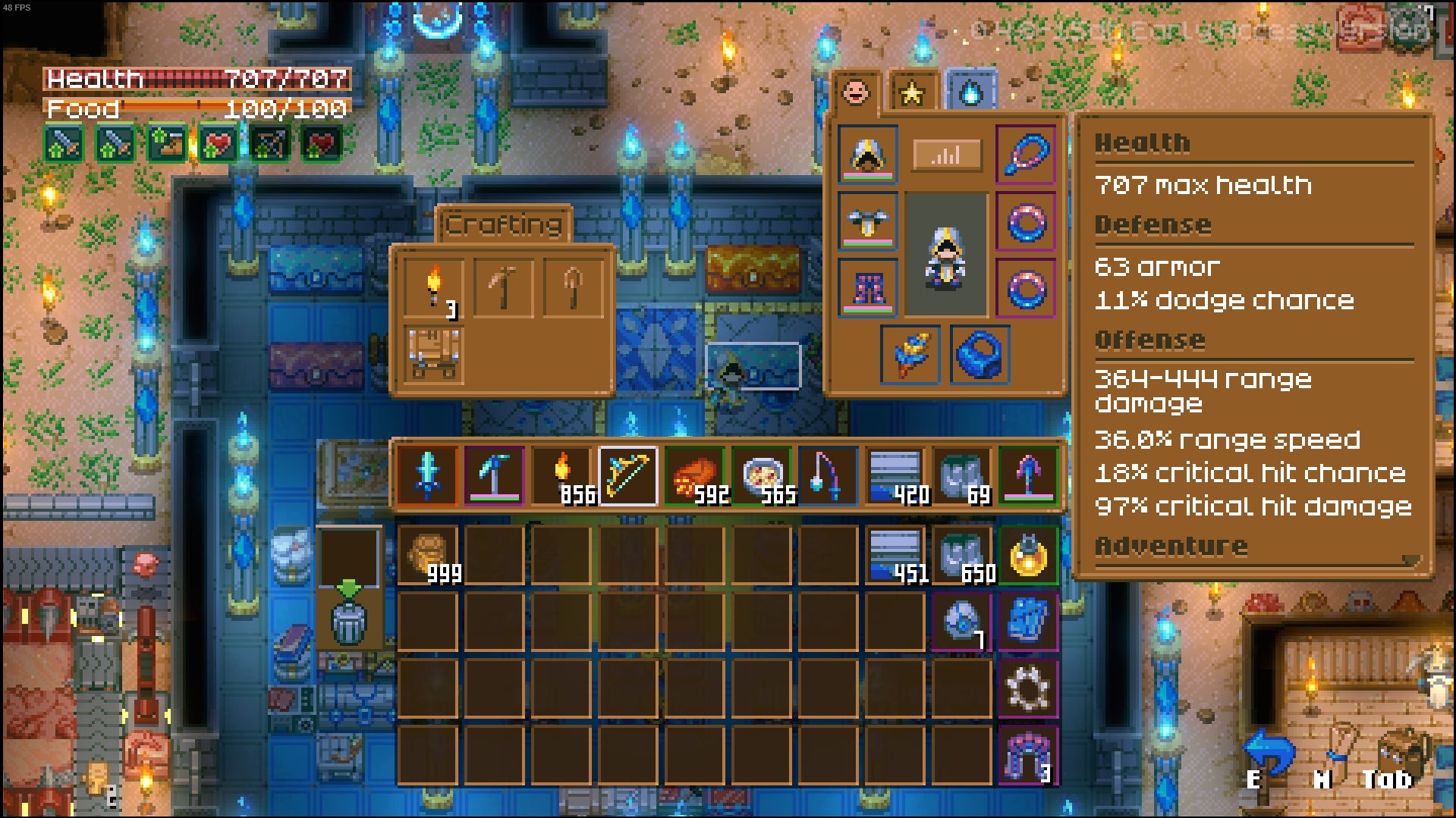
The mixels is most noticeable with the inventory interface. It looks like the weapon and armor sprites are scaled up there at a much larger resolution than everything else and it clashes pretty hard. Redrawing larger assets specifically for the inventory would be a waste of dev resources so perhaps you could try reworking the ui a bit so you can just use the weapon / armor sprites at native res.
I think corekeeper and minecraft's uis are good references to look at for something like this. Pic related.


