Indie game storeFree gamesFun gamesHorror games
Game developmentAssetsComics
SalesBundles
Jobs
TagsGame Engines

Thanks a lot for the detailed feedback! It's funny, you're not the only one that has recognized the game from that meteor animation, even though I posted that so long ago and barely got any response in the thread. Makes it feel worth it. 

But yea I agree with all your points. I rushed a lot of it at the end to make the deadline, especially the fonts like you mentioned and some of the UI art is very WIP. Was there any specific assets that you can remember that felt off besides the UI? I try to make everything pixel perfect but I've heard similar remarks before and I think I've become blind to it.

(+1)

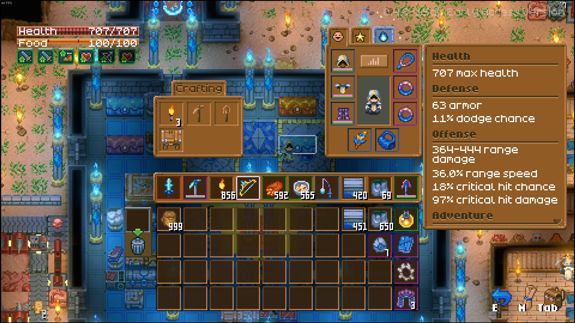
The mixels is most noticeable with the inventory interface. It looks like the weapon and armor sprites are scaled up there at a much larger resolution than everything else and it clashes pretty hard. Redrawing larger assets specifically for the inventory would be a waste of dev resources so perhaps you could try reworking the ui a bit so you can just use the weapon / armor sprites at native res.

I think corekeeper and minecraft's uis are good references to look at for something like this. Pic related.


Oh yea the inventory sprites are horrible at the moment lol, there's no reason for them to be upscaled like that. Also that's a good idea, I was thinking of just finding smaller icons for the inventory but it might still work with the 32x32 icons I have now if I make the inventory slots larger.