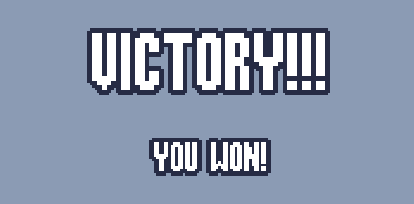
thank you! I tried a few things to make the text more visible, but I think that I am ultimately not experienced enough with Godot to adequately solve that problem. (loved your game btw)
Ah ya I know what you mean. I've had good luck in the past using these pixel fonts https://nimblebeastscollective.itch.io/nb-pixel-font-bundle, and then making the font size a multiple of 16, then they looked clean with the outline. This is with Rockboxcond12 from that bundle at 16 and 32 font size, idk if font size 16 is too big for your game tho, could maybe find a smaller base size pixel font somewhere if 16 is too big.


