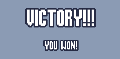
Cool concept, but the text was a little hard to read.
Play game
FRACK!'s itch.io pageResults
| Criteria | Rank | Score* | Raw Score |
| Audio | #248 | 3.370 | 3.370 |
| Theme | #348 | 3.333 | 3.333 |
| Graphics | #352 | 3.556 | 3.556 |
| Innovation | #374 | 3.148 | 3.148 |
| Overall | #418 | 3.198 | 3.198 |
| Fun | #602 | 2.926 | 2.926 |
| Game Design | #676 | 2.852 | 2.852 |
Ranked from 27 ratings. Score is adjusted from raw score by the median number of ratings per game in the jam.
How does your game fit the theme?
the game switches between calm building and intense defending periods
Did you write all the code and made all the assets from scratch?
the sound effects where from the shapeforms free audio asset pack. the code, sprites, and music where all made by our team
Comments
I really liked the music and the graphics. The game play is an interesting approach to the theme.
Really nice graphics! Some stuff is cut off out of view making it a bit hard to play, perhaps the itch.io viewport settings should be adjusted (it may be possible to do this without changing the game file at all). Otherwise really nice job on this game!
I really enjoyed the game! It took me a little while to figure out how everything worked, but once I got the hang of it, it was really fun to play! It fits the theme perfectly. The combination of tower defense and resource gathering is unique and well done. I also love the visuals! Great job!
the audio was great, the graphics were great, but there was no y-sorting. all of the tutorial text was off the top of the screen on my 1080p monitor, so i had no clue what to do lol.
This was so fun, I love the mix of resource gathering and tower defense in this game. It took me a few tries to really get a run going, but once I understood everything it was smooth sailing. I really liked dumping turrets all over my base to defend against the attacks. It took me a bit to realize the turrets pointed towards wherever the mouse was pointing when I placed them. I ended up beating the game with a score of 140, awesome job I really enjoyed this game!
That was challenging ! This kind of "tower defense"/ressource gathering gameplay is interesting though ! Good job !
Excellent execution on both the building and defending aspects. I wish the text was clearer on the background, and I think the waves ramp up in difficulty quite fast, but I have no major complaints.
Ah ya I know what you mean. I've had good luck in the past using these pixel fonts https://nimblebeastscollective.itch.io/nb-pixel-font-bundle, and then making the font size a multiple of 16, then they looked clean with the outline. This is with Rockboxcond12 from that bundle at 16 and 32 font size, idk if font size 16 is too big for your game tho, could maybe find a smaller base size pixel font somewhere if 16 is too big.

the game was really good. the art assets are well made. the screen size is abit bigger but besides that good job. also if you have time then please review my game too. my game might not be better than your game but it is fun to play.
I liked the game and the content it offers, and I think the building mode is cool. However, the size of the game screen is too large in the browser, both the width and height are very high, and I had to play with a zoomed-out view in the browser. But aside from that, great job!
unfortunately, I don't know how to fix the screen size. I set a custom resolution for the game (1920 x 1080) so that all of the Ui elements are always visible to the player. that's probably my fault for using regular labels for all the Ui and not doing anything to account for screen size. that's something to be aware of for next time, I guess. Something i was not expecting when i started making games was that trying to get the basic things like Ui to work on other systems


Leave a comment
Log in with itch.io to leave a comment.