
first of all, great job with the tutorial, it has improved a lot compared to the past, now it's much clearer in telling the player what to do.
a nitpick i have to mention is, again, on color palettes.
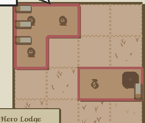
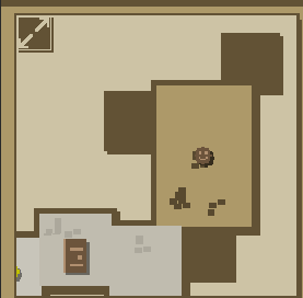
the players need to pop up more vs the backgrounds. both in the guild, and during raid.
all this dark brown over light brown nonsense is not helpful at all in conveying to the player at a glance where the various heroes are located and what they are doing. sometimes i have to squint to distinguish things from the background.

