the nuke launcher was put on top of the AA building that it's on my current "cover" screenshot in the arcade map.
now that i think about it i should have put it in a few more maps... welp
i think i got all the objects, but then i don't know what to do?
some of the objects seem to... overwrite each other?
maybe to fully go into LSD dream territory you should make it so every time you enter a level they are slightly different, and kind of warp and melt and turn into each other while you play, right now it doesn't feel very dynamic
also PLEASE make me either close the game with esc or add a pause menu.
absolutely bullshit hard. ideally you would start with easier room and then crank up the difficulty later on
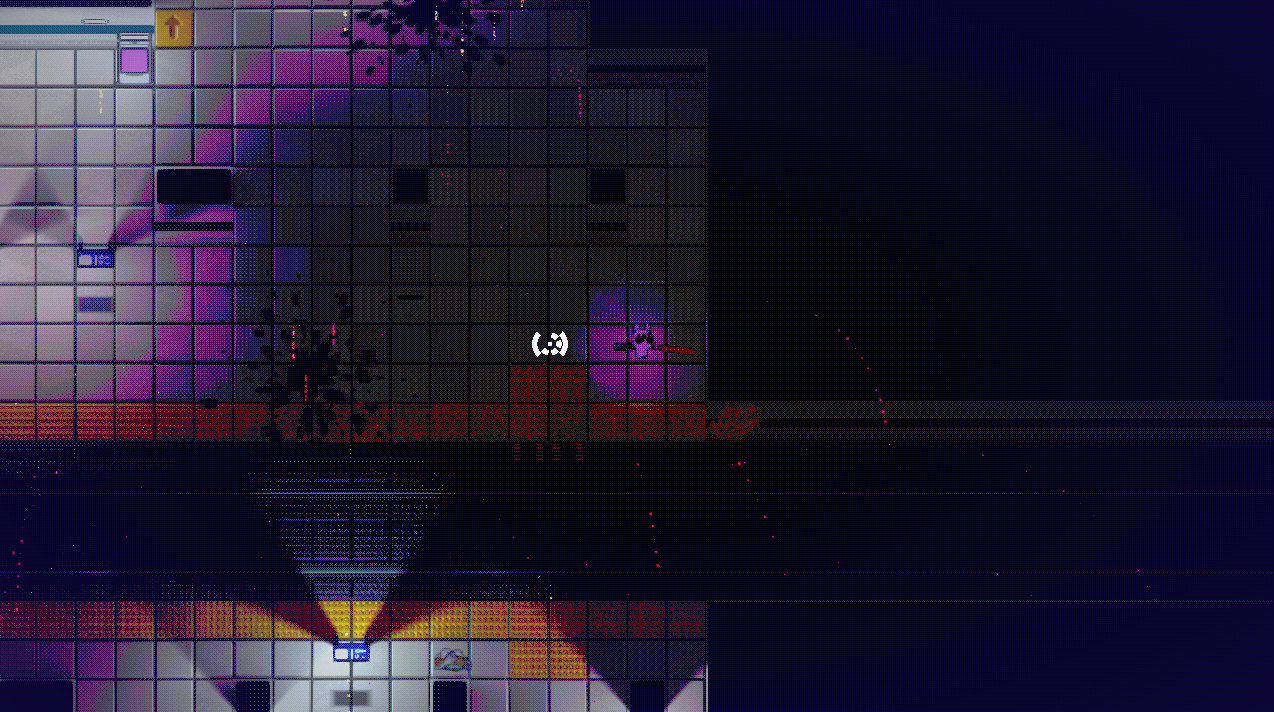
sometimes enemies get stuck on corners of the geometry of the map (pic) or on doors and i can shoot at them safely without being overram
sometimes enemies spawn right next to you and you don't really have a way to know until you have learned the spawn locations via trial and error.
i like the shotgun the most. enemies are so bulky and so fast and so numerous that trying to kill any one of them with the chainsaw is suicide. melee weapons should be much more powerful to compensate for their lack of range.
how do i set the lamps on fire? i seem to recall being able to breathe fire, but i forgot how.
had some bugs when trying to close the "door is closed" cutscene, it looked like it started multiple times instead, so while i walked around there was still the cutscene text lingering.
having the mouse sensitivity settings while in game would be nice, especially considering that you can't skip cutscenes.
having to rewatch the intro every time you die is annoying imho
also, the enemies drop way too many green orbs, which kind of trivialized combat
oh i thought food was some kind of consumable given the hunger status. if it doesn't need to be replenished then one meat is fine.
i meant that i respawned on the beach, even though i unlocked other safe areas i thought were possible respawns
the frying pan and the leiomano felt equally slow to me to be honest
played the halloween level.
the battle didn't feel as hard as the tutorial one, but i guess the fact that i already played it multiple times helps
the crow (bats?) attack used by the final boss felt kind of unfair, i mean it gives no iframes, so if it hits you and you are not at full health you risk dying in one hit before having the chance to dodge away
i got the ladder stepladder reference, but...
>we need something to reach the attic
>go to the garage to grab the ladder
>i can't
>mfw
i enjoyed it more than last time.
attacks are VERY slow, which makes dealing with multiple enemies annoying
also they don't really drop anything useful, which makes avoiding encounters altogether the optimal play
i explored until i touched some magma and died instantly. i guess it makes sense in hindsight, though i expected to take some fire damage. not being booted all the way back to the beginning.
meat seems hard to find? i have only seen it once
interesting to see the new graphical makeover with 3D animations.
the game feels much harder than before, which i guess is a good thing because it was waaaay too easy back then
you REALLY need to add outline to the text and maybe also contrasting backgrounds because some of the button labels are very hard to read.
tried a skirmish, some nitpicks
i would expect to be able to click on end turn even if i have a shop screen or upgrade screen open
then a character suddenly.. changed appearance at the beginning of a turn? i guess that without a tutorial many things naturally won't make sense anymore.
also, i recruited a treehugger and it had no way of attacking the enemy? maybe you should warn the player about it
players should be able to skip the text faster by pressing LMB
sometimes when i clicked with my mouse during movement below the character it tried to move to the sides instead
why do i have to click begin turn after selecting the attack and selecting the target? it just makes everything even slower
also, selecting the enemy to attack is kind of finnicky, with the box to click on being smaller than it should be
i hate to crab, but i genuinely struggle to see the appeal of this game. is it really a game even?
flight controls seem improved compared to last time.
there's a LOT of inertia, so even if i stop moving i keep on sliding for a long time
if you die while shooting your floating weapons keep shooting during the death screen
it's EXTREMELY easy to die, either with an enemy shooting at you or even just touching a wall the wrong way
maybe we should be able to boost sideways? would make fighting easier
lovely little games
some small complaints:
i know that it's period accurate, but there's no reason for door transitions to be SO slow.
also, on dying you should be able to skip the tip screen to respawn faster
at one point i died but i only lost 3 coins out of 34, which maybe isn't punishing enough?
i appreciate the inspiration, but i wouldn't go as far as copying the flaws of the old classics when imitating them.
the car feels a bit too fast at times, especially on a downward slope
if you add this to the bounciness of the chassis, you end up with a car that is hard to keep on the ground properly, and just tumbles all over the place
i personally enjoyed it more with the chassis bounce disabled, it felt more arcade-y, which from what i understand was the target of this build
btw playing with the mouse is fucking miserable. i don't know why anybody would ever want to. i tried it out for the novelty, but immediately went back to keyboard.
>pattern editor
>you can't edit the patterns you created beforehand
i was gonna make a list of complaints, but as it grew bigger and bigger i realized that the demo is just too unfinished to judge it properly.
please make ctrl - z the top of your priorities, it's so ingrained into me with paint and photoshop and blender that having to manually press the undo button physically hurts me.
first of all, your game is absolutely amazing. it's a joy to play through it every time
no bugs to mention, so i guess i'll focus on the balance of the weapons
railgun ammo is very scarce, and considering that it takes a while to charge it to pierce through buildings decently, it honestly does not feel reliable enough for a primary weapon during a mission long term. it's so powerful that it almost feels like a secondary weapon to deal with powerful enemies, not something you would use against tons of minions and weaker enemies.
it also happens VERY often that i mistakenly press LMB not long enough, and waste a cartridge with nothing to show for it.
the grenade is kind of situational. i can see it being useful in some circumstances, but most of the time i would rather just destroy the obstacle between me and the target with whatever machine gun i currently have equipped rather than having to press x, press it again and then wait for the grenade to finish its arc and reach the target
the scatter gun felt pretty wimpy. the scatter itself is pretty small, and by having to wait between each shot it feels like another inferior alternative to the machine guns, and the increased damage does not make up for it.
great aesthetic
if i had to make a small nitpick, the notebook pages for tutorial dialog would work great for an urban, office environment, but in the countryside while having the text written on road signs it would make more sense to have the text in road-sign-format.
also, the middle mouse attack seems way overpowered
nice to see good progress.
i like how you can sneak up on the AI
health kits feel pretty abundant in the streets level
dogs kind of keep barking even a second or two after dying
there's a bug with the collision shape of flamethrower guys not disappearing after killing them
it would be nice to have a more fitting item pickup sfx
first of all, great job with the tutorial, it has improved a lot compared to the past, now it's much clearer in telling the player what to do.
a nitpick i have to mention is, again, on color palettes.
the players need to pop up more vs the backgrounds. both in the guild, and during raid.
all this dark brown over light brown nonsense is not helpful at all in conveying to the player at a glance where the various heroes are located and what they are doing. sometimes i have to squint to distinguish things from the background.