This is starting to get really fun.
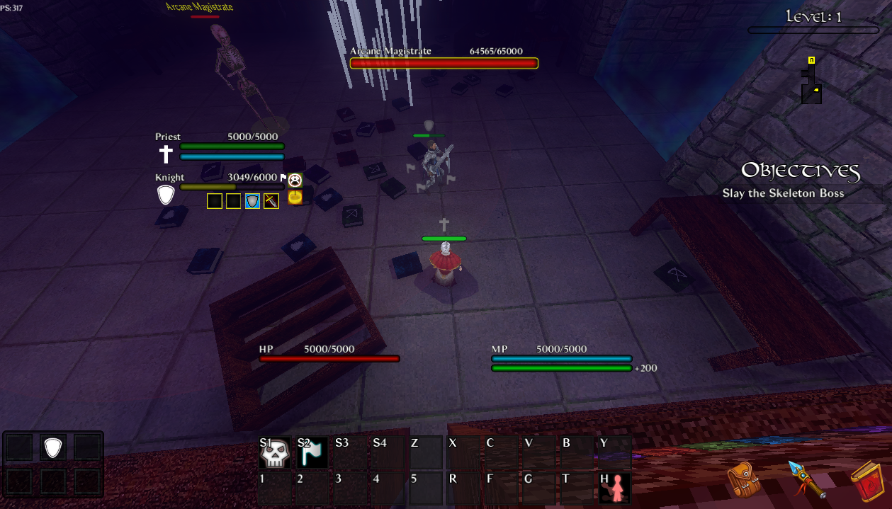
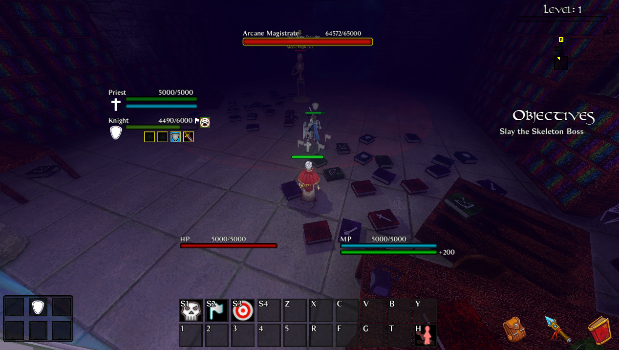
I made it to the skeleton mage boss, my team got wiped by the AoE attack, it should probably have a ring around the caster to show its range.
Last time I played there was no level timer, trying to find the exit in time is a lot more engaging than wandering around clearing skeletons endlessly.
Managing the party's aggro and helping them step away form AoE attacks works well for bossfights, but maybe you could add a "prioritize target" button just so that you don't need to move your whole party to kill one of cromwell's servants or other priority targets and risk the boss aggroing on an archer or mage.
There should be a backdrop behind the team's list UI because if your cursor is over the ability icons instead of the healthbar you can accidentally target a model through the UI.
Are the crossed scimitars crit chance? The rest of the stat icons are clear but tooltips naming them would be nice.
Regarding progression, I think that for the demo the inn should start already upgraded or at least be much cheaper just so it's easier to test different characters and composition.
Also the way spell unlocking is implemented can be a double edged sword: if you have a certain combo in mind diluting the spell pool with spells you don't want is not a good thing. Maybe some sort of limited selection mechanic could help? For example the player could select 20 or so spells that show up on levelup, then save the selection as a grimoire to choose when entering the dungeon.
Good progress since the last time I tested this, I'm going to play some more and try beating the mage boss too.


