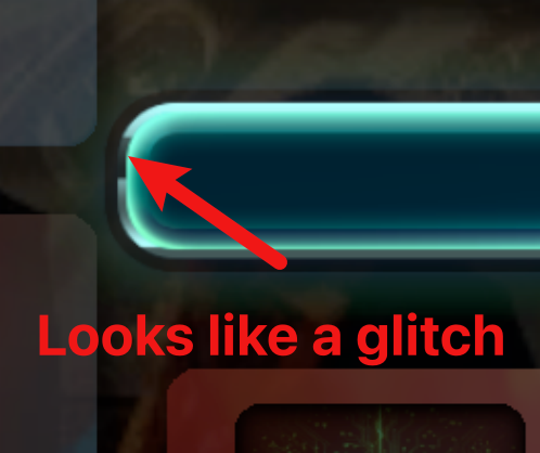
Ok, I thought it was an artifact (a glitch/badly cropped or in some other way malformed graphic) but it is just a design choice. I would go with a plain background for the progress bar because that thin black line looks like there is something wrong with it:
 Also when the progress bar fills up the glow is just cut abruptly and that is not how glow behaves. So just a small things basically.
The buildings are rectangular cards that are higher than wider. And they are stacked in a vertical scrolling group. So there is a lot of scrolling up and down which is annoying. I would arrange the buildings at the bottom and make them scroll horizontally (that way you could see way more buildings). Maybe give them separate tabs to eliminate scrolling altogeather. That still leaves plenty of space on the sides for smaller buttons.
It is about using space. You have small clickable elements in a containers that take a lot of space and big clickable elements in a containers that occupy relatively small amount of space. The first bunch leaves a lot of your UI kinda empty while the second one makes it cramped. That is why I think that your game would really benefit from a better arrangement of the UI elements - both visually and in terms of UX.

