This game blew my mind! It is fun, engaging, awesome and perfect.
Heti
Creator of
Recent community posts
I absolutely love it (except when I lose a bet, then I hate it xD) Really good and balanced gameplay loop. Nice music, characters and art. I would only improve a readability of a few things (i.e. I thought the spinning wheel has 5 uses not that it costs 5, or the cups and balls game ends abruptly and it feels bugged - there needs to be some positive feedback that the buff I won is applied). Full playthrough and comments here:
Yup, it is much better now! It is nice to see the implemented improvements like “thinking” prompt and amount of money.
Now onto the last game braking bug: In consecutive plays, the chips stays in my inventory and I can’t play them. I.e: buy a chip, put it on a slot. Next round it gets back to your inventory. Buy another chip. Try to play them: you can only swap them and cant put the chips in the slots.
It makes progression impossible: you cant challenge tougher enemies without the chips. I would also suggest implementing drag and drop mechanics as it is more intuitive for players than clicking a slot and the chip to place it (especially when there is no visual feedback indicated that you’ve selected the chip or which one). You should play your game a little more on itch (maybe some bugs are in the build and you won’t discover then in the Editor).
Good luck!
Hi! Seems like a great idea! Looks pleasant, playable. Great prototype, but I feel like you’d need to add much more content to make this interesting. And there are some clipping issues with ball and flippers (which in such a game is a no go xD so you should tweek the collisions with flippers for more precision or just go for a raycasts to make sure I would never clip through them). Anyway, here’s my playtest and some more feedback:
Ok, I thought it was an artifact (a glitch/badly cropped or in some other way malformed graphic) but it is just a design choice. I would go with a plain background for the progress bar because that thin black line looks like there is something wrong with it:
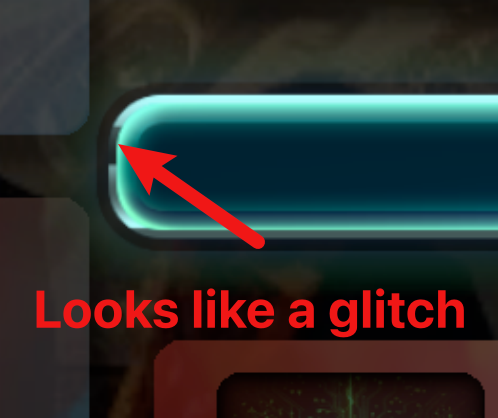 Also when the progress bar fills up the glow is just cut abruptly and that is not how glow behaves. So just a small things basically.
The buildings are rectangular cards that are higher than wider. And they are stacked in a vertical scrolling group. So there is a lot of scrolling up and down which is annoying. I would arrange the buildings at the bottom and make them scroll horizontally (that way you could see way more buildings). Maybe give them separate tabs to eliminate scrolling altogeather. That still leaves plenty of space on the sides for smaller buttons.
It is about using space. You have small clickable elements in a containers that take a lot of space and big clickable elements in a containers that occupy relatively small amount of space. The first bunch leaves a lot of your UI kinda empty while the second one makes it cramped. That is why I think that your game would really benefit from a better arrangement of the UI elements - both visually and in terms of UX.
It is a really good prototype. It is fun and engaging. It blends manual and automated resource generation nicely. It even has a hint of the story. Keep it going. I would polish some of the UI as there are graphical artifacts present. Keeping the buildings as a list is really inconvenient so I would just focus on improving UX. Goodluck!
I liked the game so much that I recorded a playthrough with a feedback. Hope you’ll find it helpful. Good luck!
Some things I’ve noticed watching my own video: 1.A deal with a frog could have a more explicit buttons. Not Accept and Continue (they both seem positive but only one makes the deal happen). Instead I would put 2 buttons at the bottom of the screen (one green one red) “Accept” and “Refuse”.
- Shield tile changes into a normal tile but it makes me forget that I placed it a lot xD Why not leave it in a shape of a shield and add a counter to it? So I know I placed it and I should not expect to draw it? OR let me hover over my inventory so I can see all my tiles so I would know whether or not I have a shield tile coming. (I would add a possibility to preview all my tiles either way ;d)
This is awesome! At first I was like: tic-tac-toe? But you know the outcome when you start… but the disappearing of blocks that deal damage? That’s genius! It changes everything. Then more interesting blocks, just soo good. Not even mentioning the cool texts of the enemies. Polish it up, put it on Steam and Nintendo Switch (no devkit/publisher? DM me), profit. Only one “bug” I found: sliders in the settings are not pixelarty.
I saw your post on reddit. I’ll point out the obvious things shortly:
- character does not face the direction he is animating (better ditch the anamorphic character and walking animation completely)
- hitboxes seem wrong - I can barely hit a tree or entity
- audio glitches out.
Seems like a first game so it’s good that in such an early stage it has a sound base - it’s playable. And has a good sound design. What it needs is clarification and feedback loop. I get the wood by chopping down trees and I can feed the campfire - why do I have to do it? How do I get meat? Just go in a certain direction with your game and try as much as you can convey it to your player - if they will feel lost, they will quickly lose interest in your game. GL!


