Indie game storeFree gamesFun gamesHorror games
Game developmentAssetsComics
SalesBundles
Jobs
TagsGame Engines

This is extremely kind, thank you for playing and for the feedback! Your screenshots made my day, and inspired a friend and I to jump into it and play around for over an hour (I’ve added some of the results of that experimentation to the game’s screenshots - do you have any objection to me doing the same with the ones you’ve posted?).

I do feel like the limited palette contributes to the charm and style of the game, but definitely found myself banging against it too when trying to portray something specific… not sure. Definitely registered as feedback to think about! (And if there are any colors you particularly found yourself missing, let me know!).

Thanks again!

Hey ! Of course you can use the screens, I don’t plan on claiming intellectual property on these patterns... at least not yet 😏 (they are a bit small though). The limited palette does the job, and this kind of limitation (like in game jams) really drives creativity. So yeah, I agree with you, restricting color choices is a good idea. Plus, you picked a super cute palette. However, a non saturated pink and yellow could be a cool addition I think...

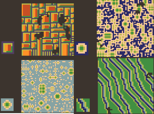
Here, I made a new batch, your new screenshots tickled my creativity, I aimed for some top down view landscapes this time (not totally baked though) . 1 : Suburbia 2 : Minecraft map 3 : Archipelago 4 : Rivers (this one is insane I think, you can make tiger stripes with black and orange too or zebra stripes with b&w )