
This might be a frequently given type of feedback, however in my opinion a quite necessary one. I really enjoy the game for its atmosphere and unique ideas, as well as the amount of detail in practically every interaction. But in terms of user experience, I find some interactions terribly cumbersome.
Some of the basic gameplay user interface elements (for example the inventory and the hotbar) are way to overcomplicated for the simple purpose they are supposed to have.
Also requiring a extensive tutorial with multiple walls of text is a very poor first impression to a game. It would be way more elegant to slowly introduce players to all concepts.
I get that the current way of solving these issues might be a placeholder, to quickly build more relevant features. But I would kindly suggest having a gameplay designer or user experience designer on your team in the near future to improve on some of the said cases.
I attached a few pictures to showcase some very quick and dirty overpaints that clean up a few usability issues I encountered. I tried to keep it as close to the original style as possible, as I found it quite charming and unique. To be very clear: This is in no way a final idea, just a quick sketch to elaborate on why I believe the user interface deserves a few changes.
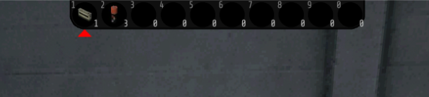
Original Hotbar
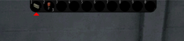
Overpainted Hotbar
Changes:
- Amount Indicator only visible for stacks, not single items. Reason: To clear out clutter
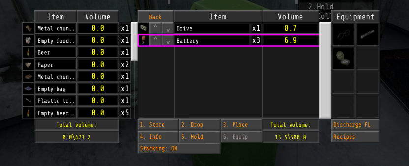
Original Inventory while Using an Item Container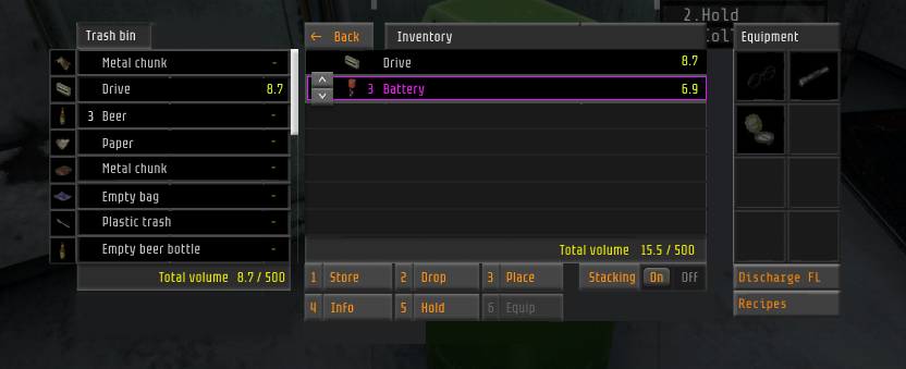
Unfinished Overpaint (Would Take to Long) of Inventory while Using an Item Container
Changes:
- Changed Container Headers to easily distinguish between the different panels
- Changed Volume Counter to only display for items with volume
- Changed Total Volume Counter to reflect each Panel at the same bottom right position
- Changed Listing Style to be a single row without columns to split types (Might be a bad change for complex items, however here it works just fine and clears up a lot of lines that clutter the visual hierachy)
- Moved amount counter in front of the item to speed up readability
- Made more space for text to avoid early truncation
- Selected item text is also highlighted
- Item Swapping is only active for the current selection to avoid overstimulating, repeating buttons.
- Introduced a more styled variation of inputs, such a an "On" "Off" Toggle
- Changed Action Buttons to "pop" a little more
I hope my feedback is of value. If not that's also fine, because I enjoyed working on this for a few happy minutes of my freetime.
- anti