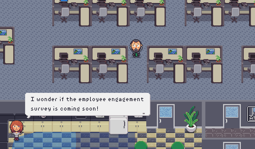
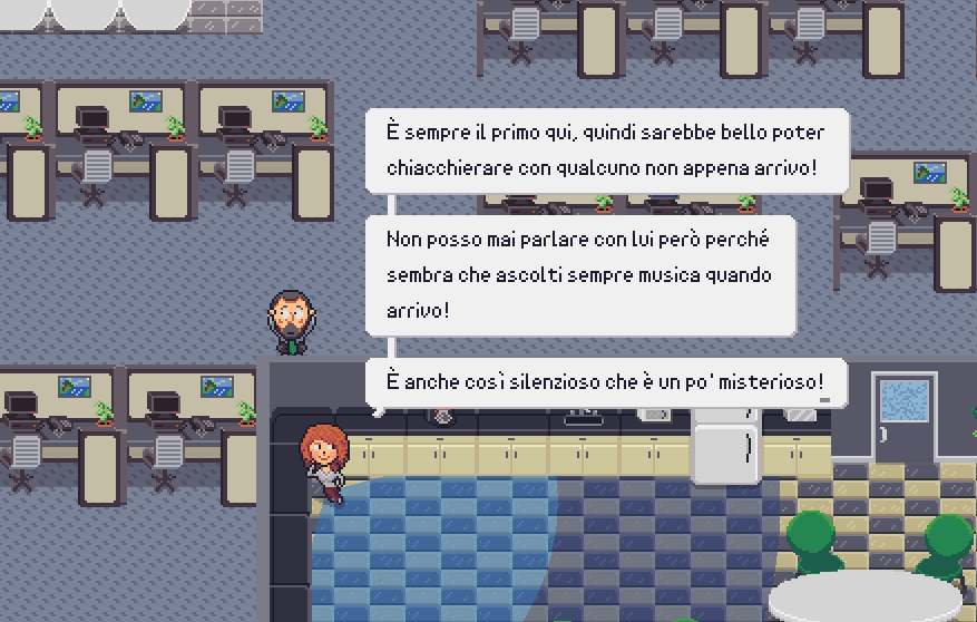
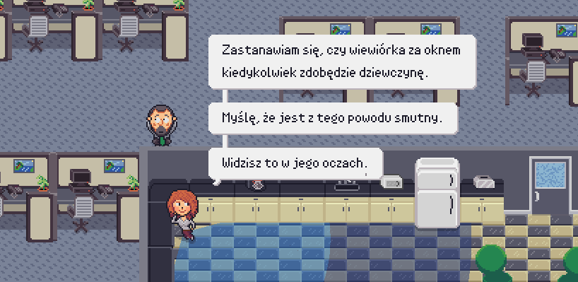
I really like how clean and readable this one is as well, with such the small font size.
Initially thought the Gs (lowercase) were getting cut off, like from the edge of my text box size/ref area, but they are that way. Then I noticed, are they backwards?

Also, do you think there is a extra space in the letters that make it harder to read? I find myself losing the spaces between the words sometimes, since the spaces don't seem that much larger, but I'll leave it to you as the font expert.


Note that I tested out reducing letter spacing ("character spacing") in C3, but that reduces the size of the spaces as well. There is no word spacing in the engine. Not shown in any of the pics above, but I can upload one if desired.
I still think it is very readable overall, but I feel like the spacing forces me to read it slower. Still 5 stars! :)

