Indie game storeFree gamesFun gamesHorror games
Game developmentAssetsComics
SalesBundles
Jobs
TagsGame Engines
(+2)

I've now figured out the problem I had with my mouse input not working (as was the case with many Jam games needing Administrative input for some reason...) I have adjusted my Rating accordingly ofc.

I have played the game thoroughly again, got all endings (I think... I got 3 different ones.) 

Here is my review:

Summary

Adherence To Theme

  • You need to pack your stuff and go to the bunker before the Raiders come and kill you. Good job on designing the game around the concept. Very well done!

Game Design

  • The controls where serviceable for a first person game made in a jam. I tend to give 3d games with a lot of mechanics a bit more leeway for jams, since it's harder to get right. That being said, a sensitivity slider, even in the most basic form is a neat addition and will help feel the game a lot more polished while literally being just a variable that you control via slider UI.
  • The hit detection needs a lot of work, at times my crosshair was right on the dude and my hit didn't connect, sometimes I was looking at another dude and hit someone behind me??? Same goes for the enemies but that is in the players favor and felt actually like it made the game fairer with them missing sometimes.
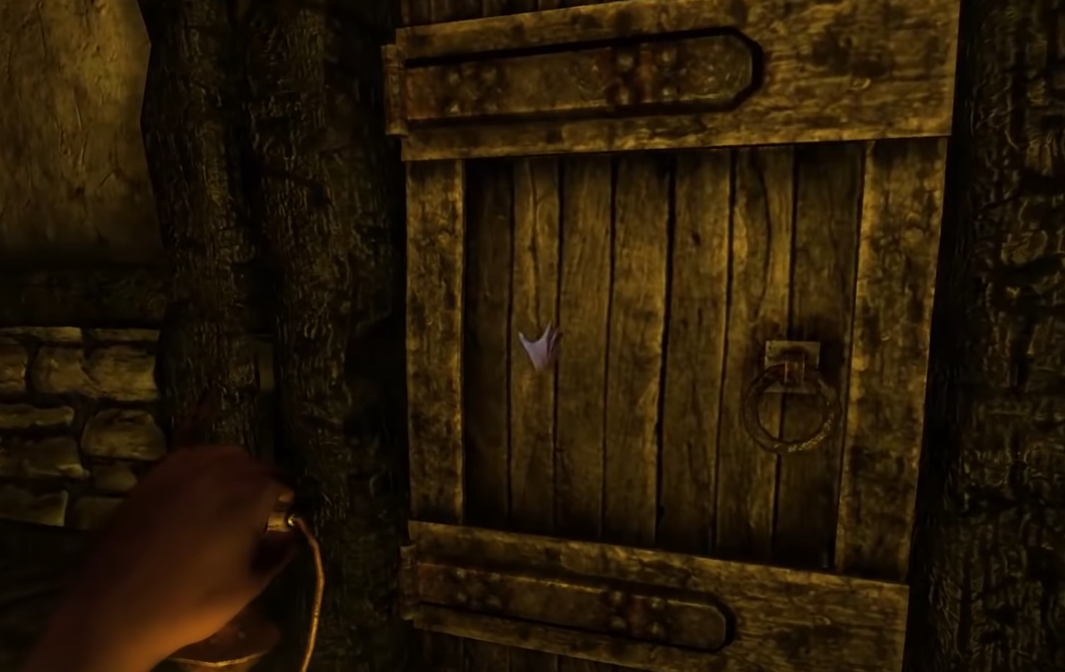
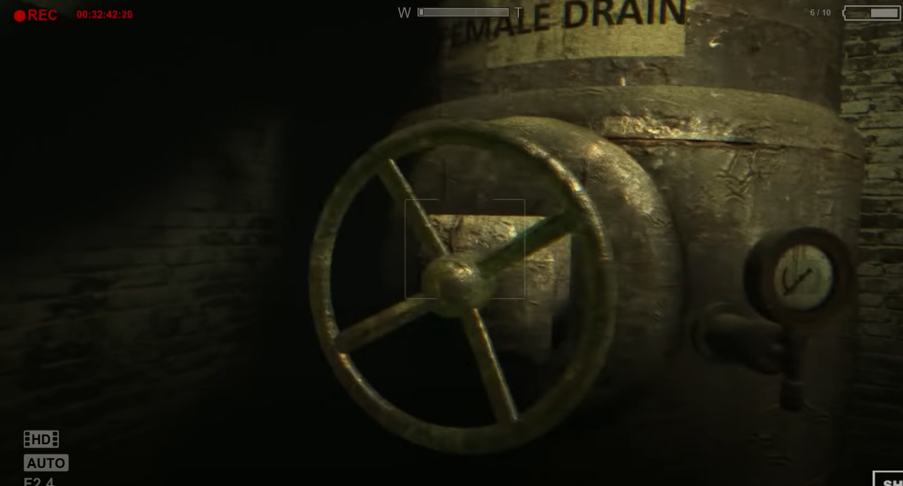
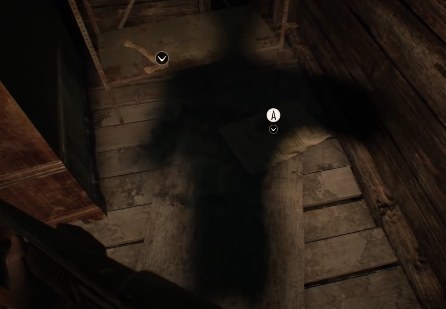
  • The looting works fine for this Jam but the Items were hidden in plain sight due to the game being extremely dark. Atmosphere should not prohibit gameplay accessibility. I suggest looking at how other horror games do it. (In my brief research I found Amnesia, the crosshair switches to a hand to show interactable objects, Outlast has them flashing on the screen when the player looks in their direction and show a Text on screen and in Resident Evil 7 there is an Icon of the controller button that shows up above Items you can pick up. My personal first thought was making them glow and move in mid air, like old school pickups found, check at the very bottom, where I included image references, which link to gameplay videos without commentary.)
  • The enemies behavior and AI was rather excellent. They where quite easy to predict when you know where they are. 
  • The Level design was very flawed. There are several places that you need to look for in terms of Equipment spawns but it is extremely easy to get stuck and die. This does not feel like it was the players fault, rather than the designers.
  • The jump does not help this at all and I found it to be rather useless. You can't jump on beds and chairs in a last ditch effort to get out of a room where Raiders swarm you and the whole system would need some more work. Perhaps designing rooms with either no Jump (making every room escapable in terms of Raiders) or with Jump (making the ceiling high enough so you can jump on stuff) in mind would help the game feel a lot better overall!
  • I found the Key spawn in the Kitchen very quickly. There are other Key Spawns though, which I couldn't find after what are a total of 10 minutes searching. Perhaps it was a bug, maybe not, but making the key spawn in a fixed location like the Radio would make sense for a Jam game!
  • From what I found, there where 2 types of Damage items. The knife, which deals 2 Damage and everything else. They were clearly identifiable as objects you stick to your enemies, which is good but the implementation along with the buggy hit detection felt a bit off. For one, I feel like they were designed as a crutch around the Level Design, rather than thinking of Player limitation when designing the Rooms. You may or may not have thought the player would hoard them in case he gets stuck and has to fight but the natural method of play was reducing the number of Raiders in an area to have a bit more time to look for spawned Items and that elusive Key.
  • The Room layout was rather irritating at first. It took me 3 tries to even find the Room where the Radio was located at, this goes hand in hand with the Level Design I was hinting at earlier.

Originality

  • The game's premise is highly original, nothing to add here. It is inspired in just the right ways and different in others.

Style

  • As this is a 3D Jam game I tend to judge it with more leeway. All in all the graphics where nice, the models where nicely done, the animations where clear as to what the Player and Enemies are doing at any given time and there were some neat lighting effects on showcase!
  • But overall the game was extremely dark. This ofc. was done on purpose but it inhibits the overall gameplay quite a bit. There is no flashlight mechanic, as you planned this sort of "hiding from Raiders" feeling but it was highly difficult making out Items in front of certain areas. Look towards the "References" section for some ways to improve this.
  • The music was good. It fit the atmosphere quite right and was well toned, not Obnoxious, or overly Loud.
  • The Sound effects on the other hand where a bit Loud to my liking , at least the Spawn sounds. This particular sound, was quite familiar as well, hmm I wonder where I heard such a noise before :)
  • What would have been another excellent addition for this game would be footstep noises that get louder the closer an Enemy is to the player, as a way of Feedback. Really good Trick that one, helps with the atmosphere as well but I understand that there was not much time to implement such a feature, as this game is quite extensive already.

Suggestions

  • Implement a way of seeing the Items more clearly.
  • A better hit detection.
  • Designing the Level with the Player/Enemy movement and size in mind.
  • A bit more feedback on the Hits and Footstep sounds or other ways of showing the player danger is lurking around a corner would polish this up quite a bit!

Overall

This was a fun little experience, the Graphics were really well done, the music was fitting and you really nailed that "Oh crap, Raiders coming, quick grab everything I can and head to the panic Room" feeling!

With some of my extensive suggestions, I'm sure you will find some useful thoughts to implement for a future version of this or other games you'll do and I hope I was of help!

References:

All images open to a Gameplay Video on Youtube in a new tab. It was tough to find examples that are not exactly at a point of Jumpscare or gruesome imagery, I hope you appreciate it :) 

Amnesia Interactibles

Amnesia: Interactables Hand Icon.

Outlast Interactibles

Outlast Glow Effect

Resident Evil 7 Pickup

Resident Evil 7 Style
(3 edits) (+1)

Thank you very much for your extensive review of our game!

To answer you some of your questions about our decisions:

The controls where serviceable for a first person game made in a jam. I tend to give 3d games with a lot of mechanics a bit more leeway for jams, since it's harder to get right. That being said, a sensitivity slider, even in the most basic form is a neat addition and will help feel the game a lot more polished while literally being just a variable that you control via slider UI

I agree that a slider, actually an "Option" menu is needed for more settings.

The hit detection needs a lot of work, at times my crosshair was right on the dude and my hit didn't connect, sometimes I was looking at another dude and hit someone behind me??? Same goes for the enemies but that is in the players favor and felt actually like it made the game fairer with them missing sometimes.

The crosshair is static so we haven't had the time to adjust the range between the melee attacks and the crosshair. Since this game is just a prototype (version 0.x1), it is definitely something to work on!

The looting works fine for this Jam but the Items were hidden in plain sight due to the game being extremely dark. Atmosphere should not prohibit gameplay accessibility. I suggest looking at how other horror games do it. (In my brief research I found Amnesia, the crosshair switches to a hand to show interactable objects, Outlast has them flashing on the screen when the player looks in their direction and show a Text on screen and in Resident Evil 7 there is an Icon of the controller button that shows up above Items you can pick up. My personal first thought was making them glow and move in mid air, like old school pickups found, check at the very bottom, where I included image references, which link to gameplay videos without commentary.)

Actually, if you hover over the items, they get highlighted and there is a tooltip to pick them up. It was a design decision to make them hardly visible since it is realistic not to see the spot where the lights don't shine. Of course, it would make the game clearly visible, but the creepy atmosphere would be gone and the difficulty would be simply too easy to solve. The item spots are build around the realistic way of that we don't find our items easily lying around in the house hiding in dark spots, so the best indicator is hovering over certain spots, so it gets highlighted and if you get a tooltip. The more panicked you are, the less easier you can find the items, which works as intended, as it seems from the feedback we've got so far.

The Level design was very flawed. There are several places that you need to look for in terms of Equipment spawns but it is extremely easy to get stuck and die. This does not feel like it was the players fault, rather than the designers.
The jump does not help this at all and I found it to be rather useless. You can't jump on beds and chairs in a last ditch effort to get out of a room where Raiders swarm you and the whole system would need some more work. Perhaps designing rooms with either no Jump (making every room escapable in terms of Raiders) or with Jump (making the ceiling high enough so you can jump on stuff) in mind would help the game feel a lot better overall!

It was because of the fact that the house builder and level designer worked separately that there are some of those effects occurring. When the house was designed, jumping was no option at all, but it is implemented later for some spots to handle. The beds on the top floor and some rooms where you get stuck definitely need a rework, you are right about that. And yes, for now it is intended to get easily stuck and die to be more careful which room to enter.

I found the Key spawn in the Kitchen very quickly. There are other Key Spawns though, which I couldn't find after what are a total of 10 minutes searching. Perhaps it was a bug, maybe not, but making the key spawn in a fixed location like the Radio would make sense for a Jam game!

There are actually 4 key spots and they spawn randomly after every playthrough! If you get the one in the kitchen very quickly, you surely have good eyes!

From what I found, there where 2 types of Damage items. The knife, which deals 2 Damage and everything else. They were clearly identifiable as objects you stick to your enemies, which is good but the implementation along with the buggy hit detection felt a bit off. For one, I feel like they were designed as a crutch around the Level Design, rather than thinking of Player limitation when designing the Rooms. You may or may not have thought the player would hoard them in case he gets stuck and has to fight but the natural method of play was reducing the number of Raiders in an area to have a bit more time to look for spawned Items and that elusive Key.

Actually, the knife one-shots an enemy and the other tools do 1/4 damage and stuns for 2 seconds, might be too short to realize it. As I level designed this, I thought that hoarding stuff is an option to do that and maybe after trial-and-error players would find it out, but it seems not to be that simple. Being stuck was a decision that it would make the game more difficult but jumping should be fixed so you can jump out of stuck situations.

The Room layout was rather irritating at first. It took me 3 tries to even find the Room where the Radio was located at, this goes hand in hand with the Level Design I was hinting at earlier.

It is intended not to find the radio that easily since there are not that many rooms to check.

What would have been another excellent addition for this game would be footstep noises that get louder the closer an Enemy is to the player, as a way of Feedback. Really good Trick that one, helps with the atmosphere as well but I understand that there was not much time to implement such a feature, as this game is quite extensive already.

You've guessed it right, we had no time left to implement that!

Implement a way of seeing the Items more clearly.
A better hit detection.
Designing the Level with the Player/Enemy movement and size in mind.
A bit more feedback on the Hits and Footstep sounds or other ways of showing the player danger is lurking around a corner would polish this up quite a bit!

Thank you for your suggestions, this will all be in our to-do-list how to make a better player experience! We, especially I (since it's my very first game jam), thank YOU for giving us very valuable feedback!

(+3)

Nice, thanks for the in depth conclusion about my points. I was right feeling a bit iffy about suggesting the items glowing in the dark then. It might disrupt the atmosphere. Still a little bit of a middleground would be quite nice to me personally, sort of just to "work as expected" a little bit more. When it comes to a Jam game sometimes you have to think about the access a player has to periphery. What might be pretty visible on your screen might be extremely dark on mine and that's a tough thing to figure out. 

On top of that comes that every person is different and you have to think about which kind of persons you want to exclude from experiencing your game. (Not applicable to this game but for example a colorblind option.) 

I re checked and you are right about the Items glowing. But they only do so when you are extremely close (possibly pickup range) and precicle on top of them. So I thought this was not intentional when I wrote this review, Also some Items spawned in mid air (most notably on the couch) so I thought they where supposed to be more arcady in nature.

It's not a big deal to me at all... After the third round I kinda knew where Items could spawn anyways. 

(+1)

Amazing feedback and i agree pretty everything you said.

(+3)

Happy to be of help, I am of course a learning dev myself so take stuff I say with a huge grain of salt, maybe second guess it. But I tried to make most points at least to be founded on some sort of solid baseline... That goes for the positive stuff as well btw. I'm not saying I like things just to make the review sound better but I actually enjoyed these aspects a lot.