The idea is nice, but you've designed the levels in such a way that there is no margin for error. Like the part pictured below. Though, a lot of the screens before it were very difficult to pull off as well. The art and the font looked quite nice though. Could you tell me what the font is called?
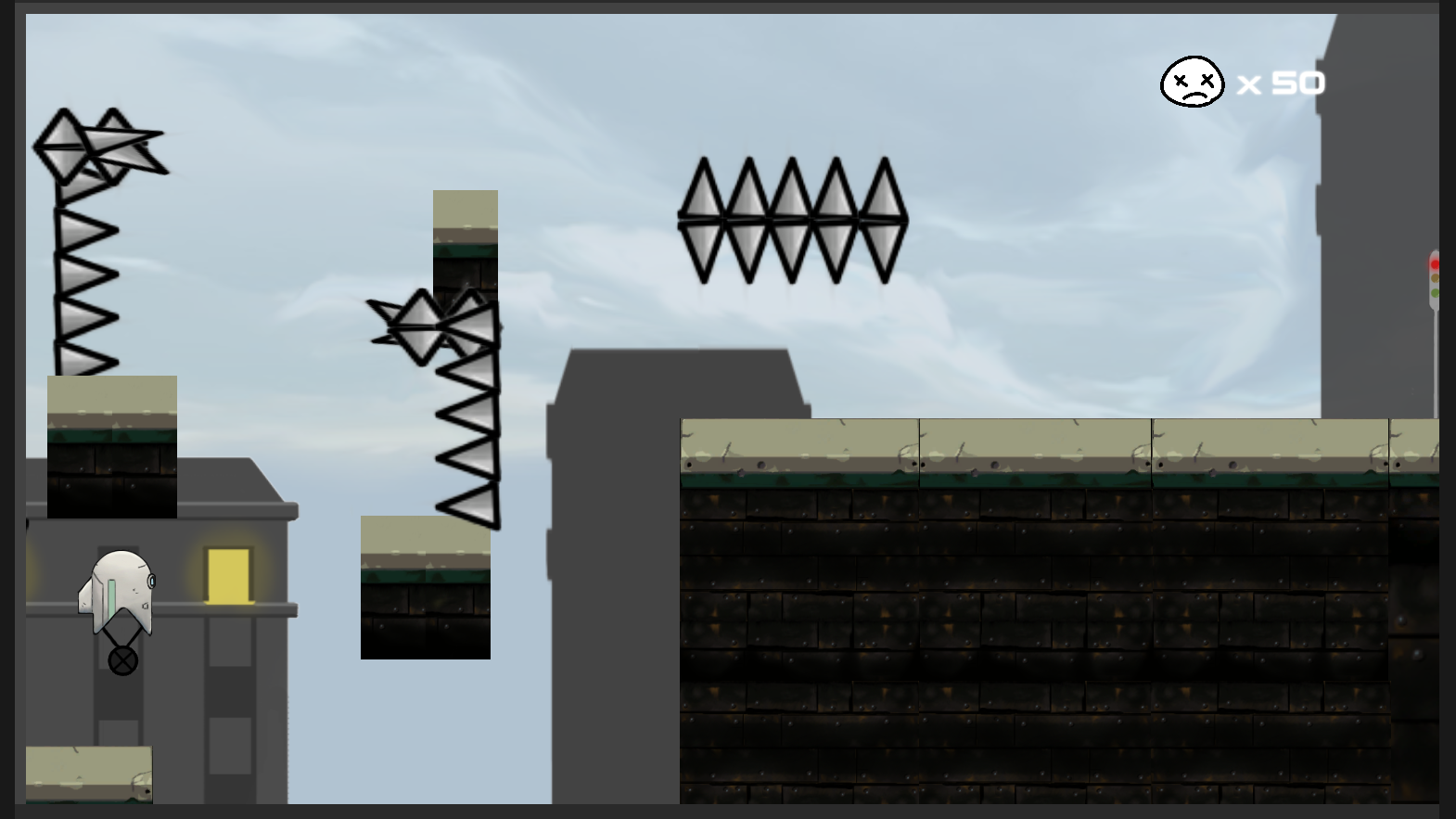
Viewing post in Broken Delivery Service jam comments
Thanks for playing and giving a feedback!
We noticed some people were stuck in this last level, we might have made the difficulty a little too high... Playing the game every few seconds while developing it made us not notice things like that. Thanks for sharing.
We used two fonts, earthorbiter and conthrax.