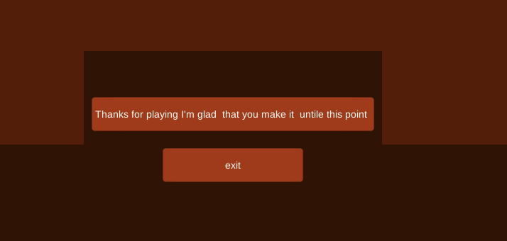
Well that was super easy!

The "transition" screen looked weird. Was that supposed to be something or just abstract? Also probably a good idea to use the "scale with screen size" on canvas so the UI stuff won't be super tiny on bigger resolutions.
The gameplay itself was interesting but not quite deep enough. The amount of health makes most levels even impossible to lose. Better level (or enemy pattern really) design would be needed. And stuff like killing an enemy that was in the way to clicked enemy for a combo system would be nice. Right now it stops to the enemy in the middle just like you clicked on it. Obviously different kinds of enemies and some obstacles would make it more interesting too.
As pretty much everyone else, I too was at first confused about the turn basedness of it. Could be made more clear with some kind of progress indicator or something along those lines.
Anyways, good job! And well done on finishing something. It seems to be quite common to go for something to ambitious and over scoped and then fail to deliver completely. Always a better idea to make something simple like this and build upon it and perfect it.

