Indie game storeFree gamesFun gamesHorror games
Game developmentAssetsComics
SalesBundles
Jobs
TagsGame Engines
(+1)

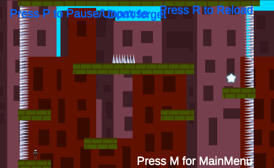
This game for me was not too intuitive but I think it could have been really cool. Some of the text was overlapping a lot to make it unreadable at the top, which maybe would have explained to me what to do in the level. The premise was good and the intro was cool. Maybe Im just bad at platformers :)

Thanks for playing the game… :)

Can you please provide a screenshot of the text overlapping…. I can’t see it in any level… Did it happen on the webgl build or the download one???

sure, here you go- its the webgl version

Thanks a lot…. Figured it out…. I had Constant Pixel Size in UI Scale mode… Changed it to Scale with Screen Size…. and now it’s fixed… Will soon upload the fixed version…. :)