
-
The art feels a bit dull in terms of color scheme. I’d recommend using a pre-made palette from a site like Lospec
-
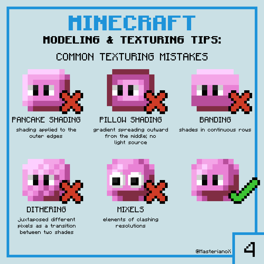
There is a lot of pancake shading
-
The header font (for example the font used for the tutorial which says “MOVEMENT”) is quite hard to read. The letters themselves look fine but I really don’t like how the dark gray outline consists of two colors
-
The flare sprite is quite banded
-
Maybe it’s just me but I find is hard to read text using large font sizes (like the tutorial text)
-
The buttons look a bit blurry
-
I think an interactive tutorial would be better than the current text-based one
-
The title screen animation is cool but the sprites themselves look like they’re just standing still (no walking animation)
-
The player’s walking animation plays even if you don’t move (maybe it’s just a weird looking idle animation?)
-
The enemy movement feels too slide-y. It’s like their skiing on ice. Perhaps they need more friction with the ground?
-
I like the player hurt animation
-
An enemy health bar/indicator would be nice
-
Decent visual feedback. Maybe some camera shake could be added?
-
Enemy damage feels inconsistent (the first hit looks like it barely does anything)
-
Cool music
-
The weapon feels a bit unresponsive. I feel like it hangs in its downward position for too long after being swung
-
Quite challenging