Pretty fun!

The controls were quite damn solid. Jumping felt very good which isn't always the case in jam games. The speed was a bit too much for me though, died so many times just due to not being accurate enough. And it's even more punishing when just a little mistake will cost you the whole run. Also due to the movement speed I found it quite difficult to precisely place the blocks as platforms in correct heights. I think like at least a third of my fails were because I just placed something so heigh that it couldn't be jumped on.
I also really dislike jumping with the up key and know for sure I'm not the only one. Having jump also be bound to space and then dying moved to something else convenient would have been the safe way to go in my opinion.
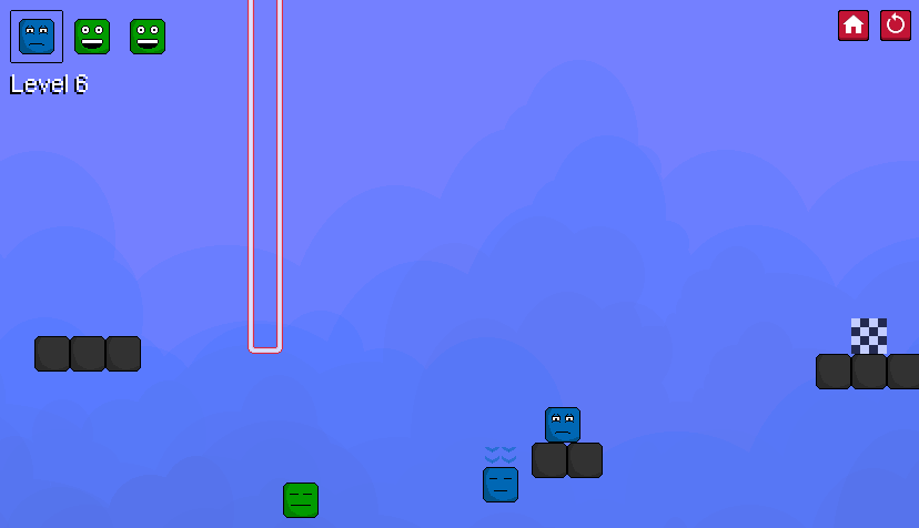
The spring was super annoying to control. Having to time its jumps wasn't too fun. I think it would be just fine to allow it to jump even if it was during the internal bounce animation. That would only get rid of that annoying holding jump and syncing up thing I had to do before every jump. But that spring own bouncing breaking the stone block was a 👌 touch.
Speaking of which, thematically wouldn't it make more sense that the (heavy) stone block would be the one that breaks the others not the other way around?
The difficulty curve was pretty ok. The overall increase in difficulty was very slight and was also completely nullified by some lenient extra blocks that weren't there in the beginning.

Was this just due to not seeing the easiest solution yourself or was it just giving the player some extra lifelines? Cause those lifelines would have been way more appreciated in the beginning. Dying could pretty much automatically full reset the level since it almost always meant that you didn't have enough resources to beat the level.
One other thing I didn't really enjoy that much was the constant need of repetition. Made even worse by the stone block disappearing and you having to repeat even more to get past a level. Of course this issue lessened down towards the latter half of the game though.
The visuals were nothing to really write home about but they got the job done well enough. And the screen shake alone bumps that score up by a star. The color selections were a bit all over the place which made the game look unharmonious. Well at least they weren't full on pure RGB colors.
Anyways, good job! First game I played so far and we're starting off pretty strong. 👍

