Maybe we should continue on the discord? :D
He he.. They all have different problems, but the two main ones are:
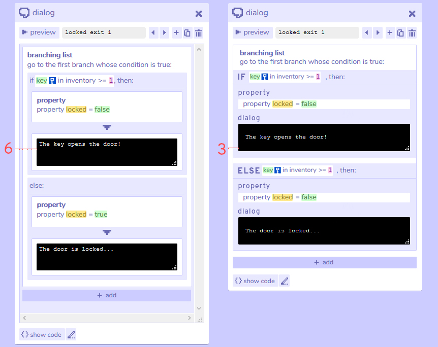
- Its one of the first things everybody wants to do, and the first time bitsy suddenly goes from minimalistic to "overloaded". I guess they are just overwhelmed by the sudden appearance of actual code and the visual layout: There are too many boxes inside boxes and the scrollbars are always visible, even if not needed --> I'm aware there is a logic to those boxes and maybe also reasons that they have to look like they look. Maybe though, there can be something done to reduce them visually. Quick sketch attached. :)
- If they added a narration instead of a lock to an exit, they often can't figure out how to go back. They are searching in the same field of the exit, but have to delete the created dialog in the dialog window first. --> Remove dialog button on exit-window

