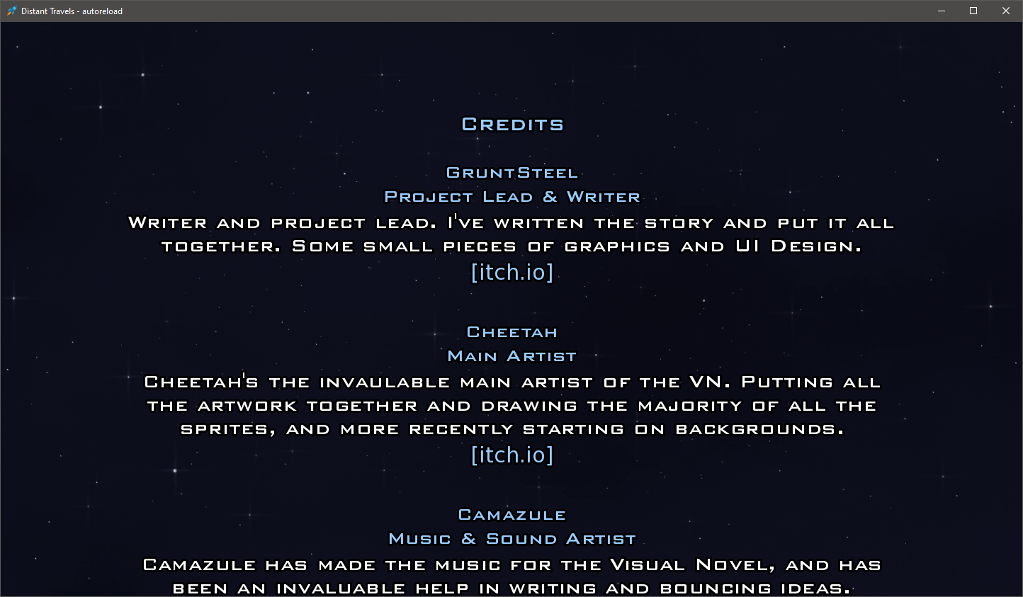
Hey there, great story however the recent changes did a number on my eyesight. Please keep accessibility in mind in regards to graphic/visual updates. Right from the launch from the game I am already having a hard time reading text on the screen. This being a visual novel style of game that's very important.
The launch screen is what prompted me to write this comment. Love the new animated space travel background. Hate the color of the menu and the music note. Its too close in hue of the background and needs a stronger contrast. I will give props on the animation though because without that moving behind the text I actually wouldn't have been able to notice the words at all. Even moving into the actual story itself the musical note I only am able to see it during certain scenes with higher contrast.
Some common ways to improve readability for us with tired/poor/colorblind visual impairments are: Use a brighter color, give the text a brighter stroke/outline, give the whole menu a black/translucent background to make further bring the colors apart contrast wise.
Also, not that you've done it (thankfully) but for the love of all, please please do not ever use a crazy font for any large part of text you're expecting your readers to read. IE you know the actual story. They're acceptable for things like titles, headers etc. Never for your main body of text. Again you're not part of that group of developers but since I was talking about readability thought I'd mention it.
Often typography and accessibility are never thought about but are a complete blocker to many when reading is the main part of this genre. They just happen to be a passion of mine from previous employment and my own impairments.


