
Buttons look fine now.
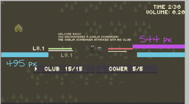
I mostly meant that the level made it seem lopsided. It turns out it is actually lopsided, but that wasn't the point. Moving the level indicator below or above the health bar could make it look balanced like I did in the pic, or adding some other indicator to the goblin. Or move the whole thing right slightly. Or do nothing. it's pretty serviceable as it is.