so you're not wishing me good luck
ambientdev
Creator of
Recent community posts
so i was able to get stuck in the pit things by pressing the teleport button when the shuriken was over them, using kb&m once also disables any further gamepad input, might want to look into that
these kinds of games need dash moves and very telegraphed enemy attacks, so that's something you could add, and also some form of health regen would be nice, like an estus flask equivalent
movement doesn't have any acceleration or momentum to it, which i think a lot of these games tend to have, even if you can also stop on a dime
art seems like it's a mix of flat colours and stock rpgmaker assets, it's not obvious which kinds of enemies are weak to which element through colour coding, i think i saw grey enemies, blue enemies and green enemies, maybe just go with rbg enemies
overall it's pretty bare, i hope this feedback was helpful
this doesn't seem to have full controller support, i tried to do right trigger+the bottom face button for the boost pad thing and it didn't work, worked fine on keyboard tho
it's obviously a mobile game and i don't know a lot about those but i can say that on a large desktop monitor it doesn't look great, i tried the switching languages thing and i thought that having to restart the game after each language change was really weird and not something i've ever seen before.
it's fine, i got a bit of early 2000s flash nostalgia from it, gj
> I would just add some animation when you enter a fight, it's a bit jarring to immediately enter it.
coincidentally i have just been working on a fade-in/fade-out for battle transitions lol, great minds think alike
>And when I level up, show some visual effect on the screen.
do you have any suggestions? like a banner at the top of the screen or an animation on the player character?
>Since you wanted criticism on the art and not the gameplay:
interface, art and gameplay loop, feedback on there not being any move or enemy variety just isn't helpful rn, though suggestions for future enemies or moves is more than welcome
>the characters blend into the background and everything is overly low visibility.
the characters are supposed to blend into the tiles, if you think the UI (stat bars, text, etc.) is too difficult to make out that's an actual problem
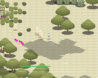
> Not sure why there's a coniferous forest on a savannah-colored map
during the day the game has a orange filter over it, it's way more green with that tint off
>don't be so defensive to criticism.
i'm not being defensive at all lol
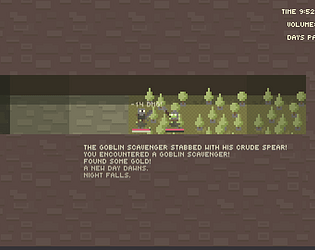
i just chose random offsets for volume and time because they were literally offscreen after i added the text explaining what the numbers were. i can probably make it lighter at midnight-ish.
>It also feels like everything's piling up on the top of the screen.
i mean there are supposed to be four buttons onscreen, i just haven't implemented them
>The buttons are weirdly uncentered, could center them relative to the friendly health bar but it doesn't seem like it?
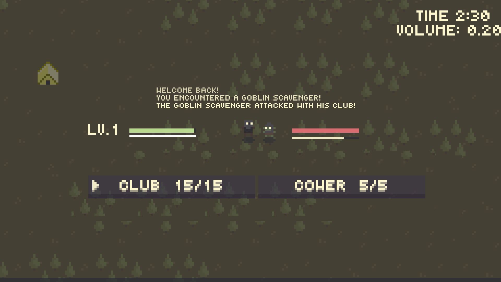
how's this
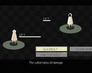
>The health bars look kinda off thanks to the level display.
what's wrong with them? not sure what you mean
>Combat feels nice, sounds nice. I think the game loop is okay? nothing jumps out at me as being off.
ty
really fun, but the art is quite bad and it's VERY easy to loose track of the crosshair
like having grayscale or super saturated enemies would help the crosshair stick out more, or any other kind of colour contrast, but as it stands this is a major flaw with an otherwise really fun game, you probably need to come up with a new colour palette for either the enemies or the crosshair
yeah this is basically just to get feedback on how the interface, the art and the combat loop feel. i guess i could penalise XP gained for the first few hours after resting, or give you a bonus to XP gained the longer you go without resting or give it a camping supplies cost or something.
cower and club are functionally identical apart from the number of charges they get, attack damage is just slightly randomised.
this is pretty much just hogpocalypse sow, one of yatzee's dev diary games, but zoomed out and with the camera tracking the player, which it makes it exponentially better than hogpocalypse sow. i didn't notice a reload mechanic or the shield thing where enemies will have different coloured armour to their damage type, which were good things about hogsow that maybe you could implement.
the art isn't great and i don't think the core idea was ever particularly interesting, even when yahtzee did it, but maybe with better polish it could be good so gj
i meant jump buffering/ coyote time, so like being able to jump shortly after walking off a ledge instead of only being able to jump if you're in contact with the ground
i would like air control when the mech is falling after the rocket jump reaches the top of its arc, just would feel natural, also it's really weird that you can't change the direction you're facing in midair
oh pickups do work there's just no visual feedback outside of them greying out, my bad
so this is a pretty standard twin stick shooter roguelike, you've got the gungeon roll and everything. i'm making something similar (but not a roguelike) and two things i've founds to be true are you want the played to always be in the middle of the screen and enemies should lead projectiles if they're not going to shoot them in patterns, there's already a game which kinda has this same horror aesthetic in "lovecraft's untold stories" but it's a lot more claustrophobic
i've got a script which lets enemies predict where the player is going and aim there, maybe do something similar if enemies are just going to shoot one projectile
it just feels pretty generic, as someone who has played a lot of these twin stick shooter roguelikes i'd prefer something that plays a little different
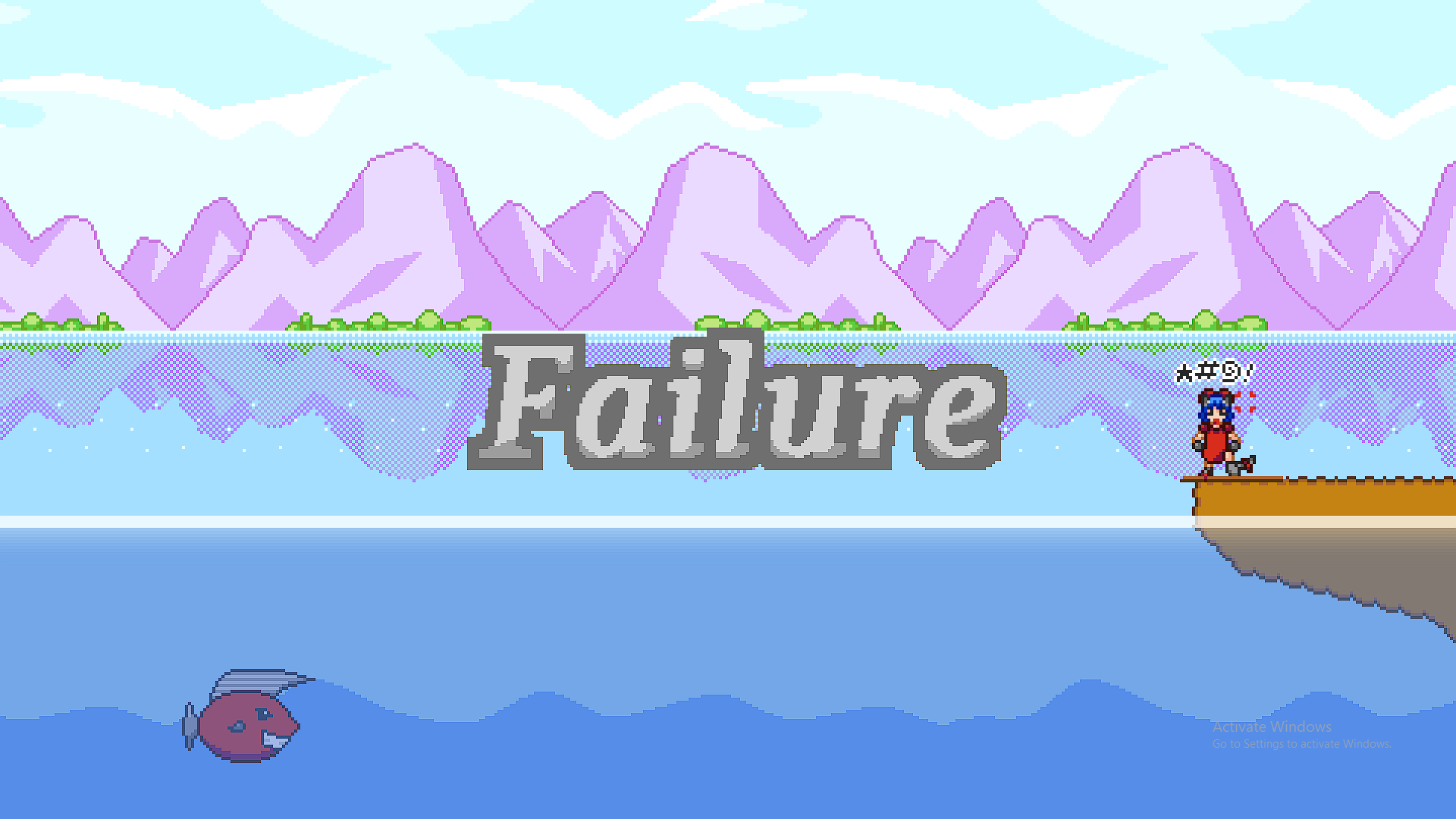
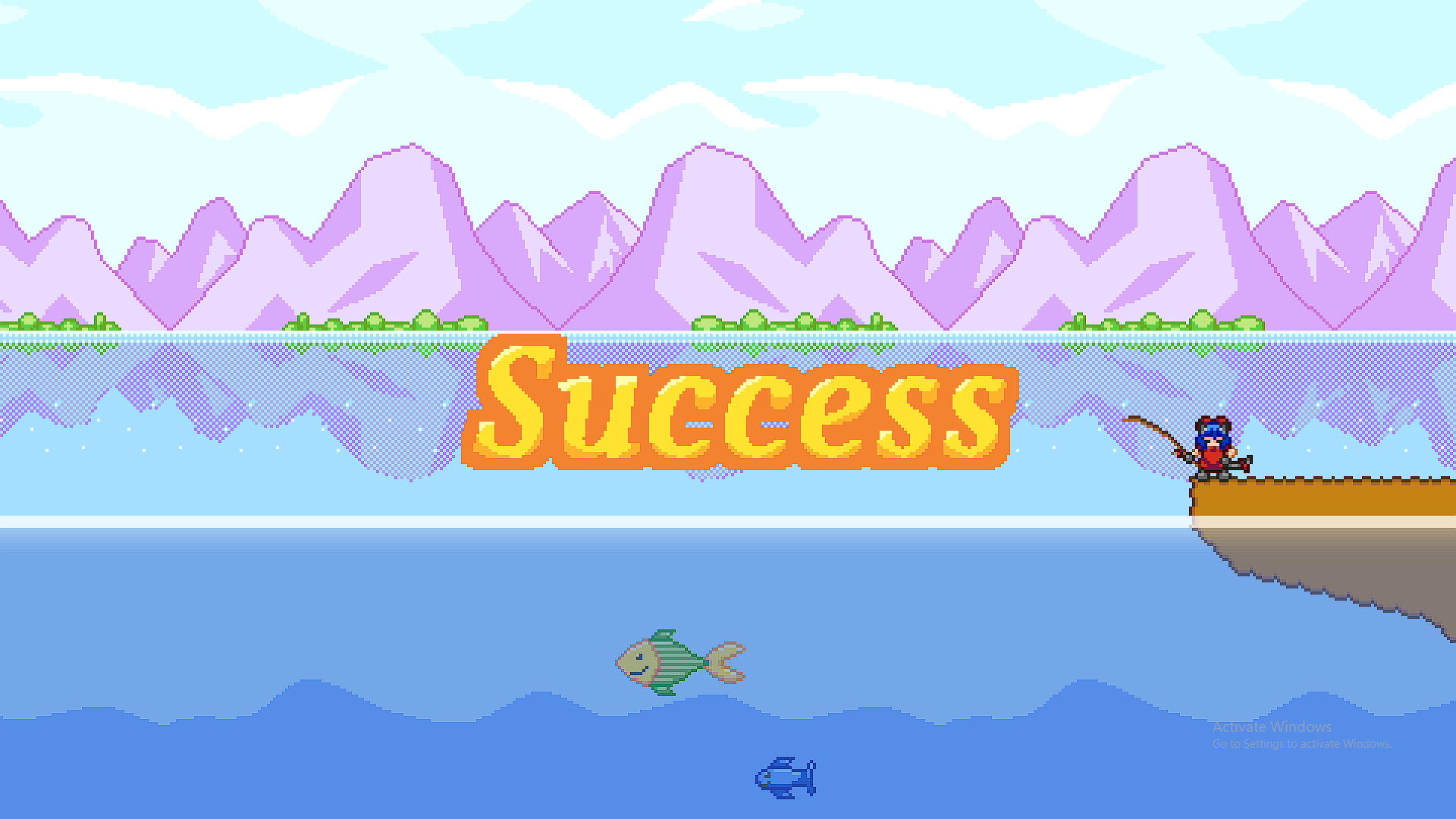
so i failed the first time because i thought you had to alternate pulling and reeling, because i thought reeling had something to do with controlling the amount of slack you have in the line so it doesn't break and pulling was just a sharp decrease in slack
it doesn't feel like fishing or even a fishing game, like the two i'm most familiar with are far cry v where you control slack in the line and you have to pull against the fish's movement and pokemon where you have to time the pulls to a text prompt
for a minigame it's fine but it feels like a turn based rpg more than anything, also there doesn't appear to be a system for making additional money off it, you just go past a certain amount and you win
art is fine, it's very tohou-esque, i'd either lean into the "it's an rpg battle system thing" with like different types of pull and reel moves and maybe different fish countermoves or make it more like other fishing minigames
i really didn't like how the hitbox isn't centered over the sprite vertically, diagonal movement seems to be faster than vertical or horizontal individually and overall your movement speed, your paddle size and the balls movement feels nothing like pong
i didn't like how you have to build dash meter instead of it just being a move with like a cooldown or a recovery state, the attack hitboxes seems too small and to last for too short a time
i found a ton of debug shit on the screen too, but i like the sprites and the sfx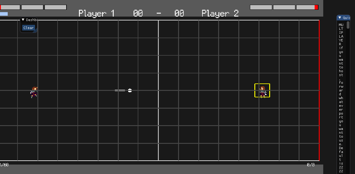
yeah the acceleration input bug's been fixed
the leveling/ timer is meant to work like that
projectile speed has been decreased, view's basically halved now, the idea is that projectiles are aimed at where the player is going to be so you're supposed to change direction, i'm definitely going to explain this and the UI better with text


