Okay, this is a really solid entry! The movement is fast, dynamic and satisfying. The controls are basic, intuitive - good. The music is just straight up FIRE. Especially the track from lvl3, which just reminds me of the soundtrack from NFS:MW (ah the soundtrack in that one :D ). The player animations are also pretty neat :) A huge layer of polish as well, which is very impressive.
Criticism-wise, the blending of styles is very inconsitent. The trees in the background feel very cartoony, wheras the bushes and trees in the foreground have a far smoother look (which I think suits your game a bit better). Then there's the stretched default cubes. The beat visualiser and the hook-dash are another style completely, reminiscent of the lights and heavy bloom of Hollow knight's soul, or Ori and the Blind forest. You can absolutelly go in any of these directions, but you can't really go for all of them at once - it makes the game look quite a bit messy. Again, interface design, scoreboard integration and the movement is excellent and just juicy, just the visuals seem a biiiiiit all-over-the-place.
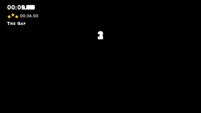
Just something completelly random, one time when I restarted (possibly after disconecting from internet, or alt-tabbing), I got respawned into a black scene, with the counter numbers overlaying on top of each other. Only happened once in over half an hour of gameplay, so it's rare.
Viewing post in Gustavo Go! jam comments
I agree on the style inconsistancy, it's mostly because our artist never really did environments on games, and he had to learn how to do them from scratch basically, also we were putting off changing the default cubes for too long and in the end, we didn't have enough time to change those :P
I noticed that bug once too, no idea what could cause it

