On Sale: GamesAssetsToolsTabletopComics
Indie game storeFree gamesFun gamesHorror games
Game developmentAssetsComics
SalesBundles
Jobs
TagsGame Engines
(+1)

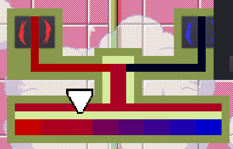
The horizontal mixture bar is just there for the "water flow" not to be abruptly cut upon entering the play area)

And it was unneededly hard to make she whole flow go to the correct spot, as would either need manual locating for any level and any random spot, or a whole lot of code to position all the rects via script.

I've decided to go for compromise and make top part fully static, while the bottom play area creates itself completely automatically, based on just two variables - "quantity" and "correct rectangle".

(1 edit)

I'm talking about this bar silly, which is part of the background, The one that adds a nice touch of difficulty to the game.

It would be nice to know which button increases and decreases the flow. I had to click around to figure it out since it wasn't instant (just like in real life :p)

Well, look:

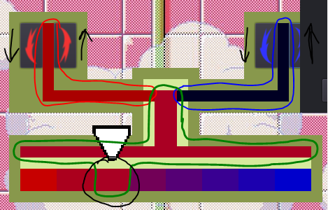
What's in red - is red component, what's in blue - blue component.

And what's in green - is all the same color all the time. Effectively, you don't have to look at the top part of the tap, as it's just a supporting graphics. You can play only looking at the black circled rectangle. And at the boy's status, that helps a lot.

Yeah, I've given the game to another person to test, and she caught the way pretty fast, and found even better strategy than the one I used the whole time while testing. The only problem she reported was no signs on the buttons. That's why I added some arrows and rearranged buttons, to "open" counter-clockwise. _I've literally just realised, and the arrow facing down, which is meant to "close" the handle, is actually facing the same "oppening" direction xD_ But if I'd made it looking up, as clockswise "closing", that would just leave us with 2 buttons showing "up" (hence - "increase"), which would be even worse.

So, we have 1 up - more - and 1 down - less - button on each side, and a nice reck just in the middle in gamma, to easily spot if it's redder or bluer than needed.

I'm guessing it's just terrible design and graphics, if this is not as intuitive as I supposed. I'm really bad at those, sorry(

(2 edits)

I'm sorry, while I fiddled my way to victory I missed several details. I was mostly looking at the man through most play-troughs.
Here's a picture to break this chain of misconceptions. We can ignore the top part as it's static.


First off, I was joking and referring to 2 and should have pointed to it from the side.
Secondly, I thought the purpose was to match the color in 1 with the value in 3. Of course, as you explained, 1 = 3. You should probably add some indicator of where 3 is and either leave it empty (so the player has to visualize 1 in 3) or maintain the same functionality. Either way is fine.
And third, I thought the down/up buttons had parenthesis and didn't notice they were arrows. Making those arrows wider would help.

So there it is, focusing on the bars instead of the man would make it clear. But I was watching to see how he'd react to me fumbling with the temperatures.

Also, color changes are instant, they are just not very big, otherwise the game would be unplayable, as you need fine tuning, instead of skipping half of color range in one click.